Are you looking for an easier way to analyze large amounts of data without getting lost in the details? Google Sheets pivot tables might be just what you need. They allow you to quickly organize, summarize, and analyze data in a way that’s both efficient and easy to understand. Whether you’re tracking sales, expenses, or any other data, pivot tables help you spot trends, make comparisons, and find valuable insights with just a few clicks. With their simple drag-and-drop interface, pivot tables let you transform raw data into something that’s both useful and easy to digest. This guide will walk you through everything you need to know to start using pivot tables effectively in Google Sheets, from the basics to more advanced features.
Understanding Google Sheets Pivot Tables
Pivot tables are a powerful tool in Google Sheets that allow you to summarize, analyze, and present large sets of data in a concise and organized manner. These tables transform raw data into insights, making it easier to spot trends, calculate aggregates, and view data from different perspectives. Pivot tables essentially “pivot” data into a format that’s easier to analyze, which can be incredibly helpful when dealing with complex datasets. Whether you’re working with sales data, financial statements, or any other large dataset, understanding how pivot tables work is essential to harnessing their full potential.
What are Pivot Tables?
A pivot table is an interactive table that automatically organizes and summarizes data from a larger dataset. It allows you to group and filter your data by categories, perform calculations like sums or averages, and rearrange the table to display insights that are most relevant to you. You can think of pivot tables as dynamic summary tables that give you control over how your data is presented, without altering the underlying data itself.
With pivot tables, you can easily:
- Aggregate data across categories (e.g., total sales by region or product).
- Group data by time periods (e.g., monthly sales or quarterly revenue).
- Perform quick calculations (e.g., averages, counts, and percentages).
- Analyze data from multiple dimensions (e.g., looking at sales by product and by region).
Why Use Pivot Tables in Google Sheets?
Pivot tables in Google Sheets provide an intuitive way to analyze data, and they come with several advantages:
- No need for complex formulas: Pivot tables allow you to perform calculations like sums, averages, and counts without needing to write complicated formulas.
- Quick summarization: Pivot tables can instantly summarize large datasets, making it easier to spot trends and insights.
- Interactive and customizable: You can drag and drop data fields to arrange and analyze them in various ways. It’s highly flexible.
- Easy data aggregation: Instead of manually summing or averaging data, pivot tables handle this automatically.
- Built-in filters: Pivot tables make it easy to filter and display only the data that matters to you, helping to focus on key insights.
Pivot tables save you time and effort, offering a fast, easy, and powerful way to manipulate data within Google Sheets.
Key Benefits of Pivot Tables in Data Analysis
Pivot tables offer numerous benefits, making them indispensable for anyone looking to analyze data efficiently. Here are some of the key advantages:
- Speed: Pivot tables automate the process of summarizing data, saving you time on manual calculations and allowing you to focus on analysis.
- Flexibility: You can drag and drop fields to explore your data from multiple perspectives, giving you a customizable view of your information.
- Insightful summarization: By grouping data and calculating aggregates, pivot tables provide a higher-level view of your data, helping you make data-driven decisions quickly.
- Data visualization: Pivot tables can help you visualize data trends without the need for external charts. By summarizing and organizing data into rows and columns, they reveal patterns and insights more clearly.
- Ease of use: Even if you don’t have advanced technical skills, pivot tables are easy to set up and use, making them accessible to a wide range of users.
- Accuracy: By automating calculations, pivot tables eliminate human error in data analysis, ensuring that the results are accurate and reliable.
- Scalability: Pivot tables can handle large datasets with ease, making them suitable for everything from small reports to complex, multi-million row spreadsheets.
By mastering pivot tables, you gain a powerful tool that simplifies data analysis, offering more time to focus on interpreting the insights and making informed decisions.
The Components of a Pivot Table
Pivot tables are incredibly versatile, but they can seem a bit overwhelming at first glance. Once you get a handle on the different components and how they work together, you’ll find that creating insightful reports is easier than you thought. The components—rows, columns, values, and filters—are the foundation of any pivot table. Let’s take a deeper look at each one.
Rows, Columns, Values, and Filters Explained
At the core of any pivot table, you’ll find the rows, columns, values, and filters. Each of these components serves a specific function to help organize and summarize your data.
- Rows: The rows are where your data categories are organized vertically. Think of them as the labels that categorize the data. For example, if you’re analyzing sales data, you might set “Product” as the row. Each unique product will have its own row in the pivot table, making it easier to compare sales for each product.
- Columns: The columns serve the same purpose as rows but are organized horizontally. In a sales analysis, you might use “Month” as a column, which will allow you to see how sales have changed month by month for each product. You can add multiple fields in the columns area if you want to compare more than one factor, such as “Region” and “Month” to see sales performance across different regions and times.
- Values: This is where the actual calculations happen. The values are the metrics you want to analyze—usually numbers. For example, in your sales table, you might want to display the sum of sales for each product by month. The pivot table will automatically aggregate the numbers for you based on the function you choose (like SUM, AVERAGE, COUNT, etc.).
- Filters: Filters are a way to narrow down your data. With filters, you can focus only on specific parts of your dataset. For example, if you want to see sales data for only one region or a specific date range, you can apply a filter to display just that data. Filters can help you analyze smaller, more specific datasets without creating separate pivot tables for each segment.
Each of these components plays an important role in helping you organize your data and uncover the insights hidden within. Understanding how they interact with each other is key to getting the most out of your pivot table.
The Role of Aggregation Functions
When you create a pivot table, you’ll often want to summarize your data in a way that provides more meaningful insights. Aggregation functions are what make this possible. These functions allow you to perform calculations on the raw data to turn it into something easier to understand.
- SUM: The most common aggregation function, SUM adds up all the values in a given range. For instance, if you’re analyzing sales, you would use SUM to calculate the total sales for each product in each region.
- AVERAGE: This function calculates the mean value for a range of numbers. You might use AVERAGE if you want to find the average sales price or the average number of items sold.
- COUNT: COUNT is used to tally the number of entries in a given field. This is helpful when you need to see how many times a particular event or condition occurs, such as counting the number of sales transactions.
- MAX and MIN: These functions return the highest (MAX) and lowest (MIN) values in a dataset. For example, you could use MAX to find the month with the highest sales or MIN to determine the month with the lowest sales.
- Custom Functions: Google Sheets also allows you to create custom functions using calculated fields, which means you can combine multiple aggregation methods to generate unique insights. For example, you might want to create a custom formula to calculate profit margins (Revenue minus Cost of Goods Sold) and display it in your pivot table.
Choosing the right aggregation function is crucial to ensuring that your pivot table displays the data you care about in the most useful way. Whether you’re tracking sales, performance, or any other metric, the right aggregation method will help you identify trends and key takeaways.
Customizing Data Presentation
One of the great strengths of pivot tables is how easily they can be customized. With just a few clicks, you can adjust the layout, format, and appearance of your pivot table to make the data more understandable and visually appealing.
- Adjusting Layout: You can change the layout of your pivot table to highlight different aspects of your data. For example, you might switch rows and columns to see the data from a different perspective. If you initially set “Month” as the rows and “Product” as the columns, you can reverse these to see how the products performed over time. This simple adjustment can provide new insights into the same data.
- Number Formatting: Pivot tables automatically apply basic formatting, but you may want to tweak it to improve readability. You can format numbers to display as currency, percentages, or add decimal places for precision. For example, sales numbers can be formatted as currency to make them easier to interpret at a glance.
- Grouping Data: You can group data in several ways, depending on what you’re analyzing. If you’re working with dates, for example, you might group by months or quarters. This helps break down large sets of data into smaller, more manageable chunks. Similarly, you can group numeric data into ranges—such as grouping sales figures into brackets (e.g., $0–$1000, $1001–$5000, etc.).
- Conditional Formatting: Google Sheets allows you to apply conditional formatting within your pivot table, which can make it easier to spot trends or outliers. For instance, you can use color scales to highlight the highest and lowest values, or apply icon sets to indicate performance (such as a red arrow for declining sales and a green arrow for increasing sales).
- Dynamic Titles and Labels: Pivot tables also allow you to use dynamic titles and labels, which change automatically when the data is updated. This is especially useful when you want to give context to your data. For example, you could have a title that reads “Sales Performance in [Month]” where the month changes based on the data displayed.
Customizing your pivot table not only makes it easier to interpret but can also make your reports more professional and visually engaging. The goal is to make the data work for you, not the other way around. By tweaking the presentation, you can create reports that highlight the most important information and help others quickly understand the insights you’re sharing.
How to Create a Pivot Table in Google Sheets?
Getting started with pivot tables can be intimidating if you’re new to data analysis, but don’t worry—it’s easier than it looks. Once you understand the process of creating a pivot table, you’ll find that it’s an incredibly powerful tool for summarizing, analyzing, and visualizing your data. Let’s walk through the process of creating your first pivot table and understanding the editor.
1. Create a Pivot Table
Creating a pivot table in Google Sheets is straightforward. It only takes a few clicks to generate a table that will help you analyze large amounts of data with ease. Here’s how you can create your first pivot table:
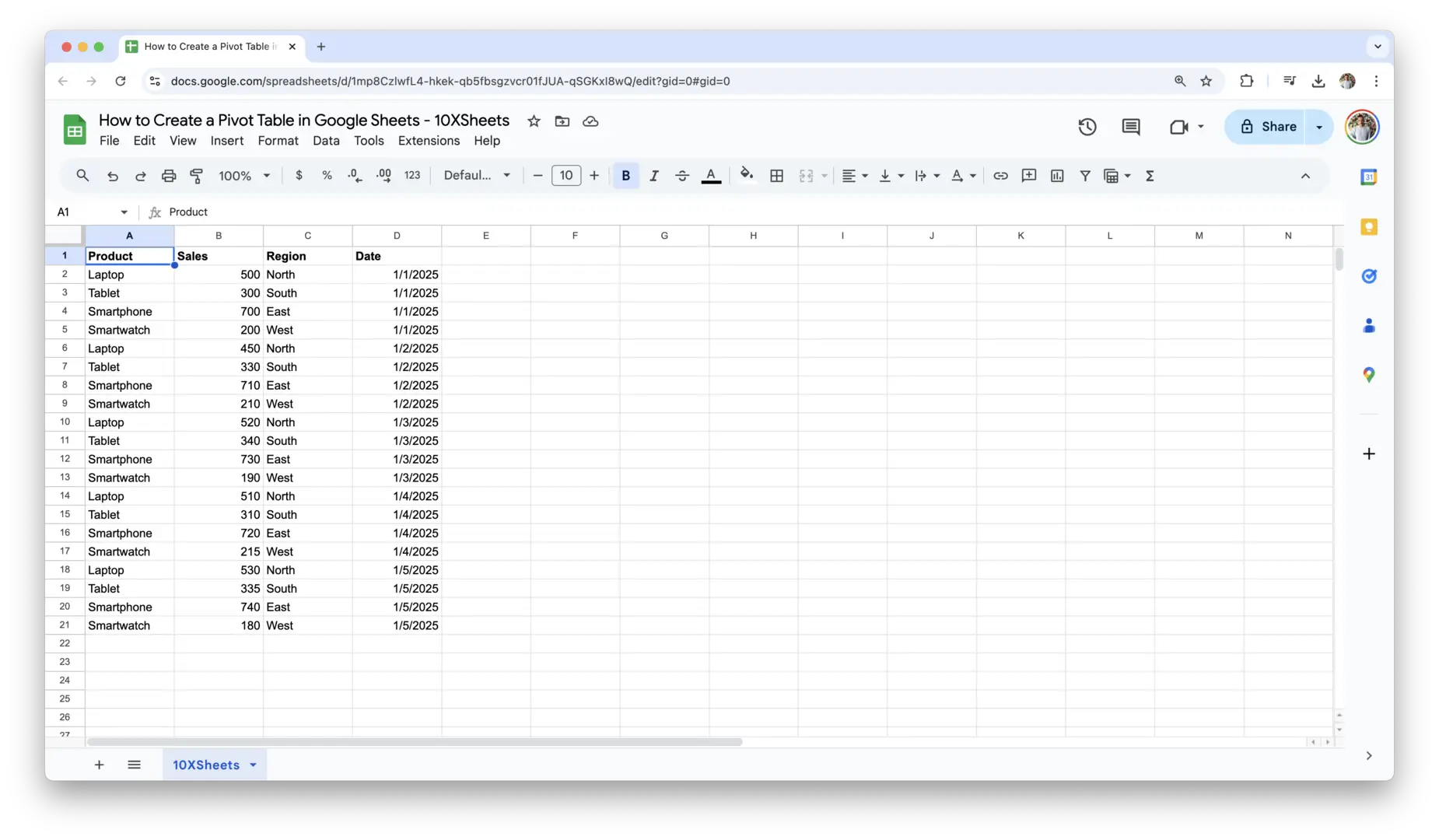
- Prepare Your Data: The first step in creating a pivot table is to ensure your data is organized in a simple table format. Your dataset should have clear column headers (like “Product,” “Sales,” “Region,” “Date,” etc.) with no blank rows or columns. If you have any empty rows, delete them to avoid problems with the pivot table.

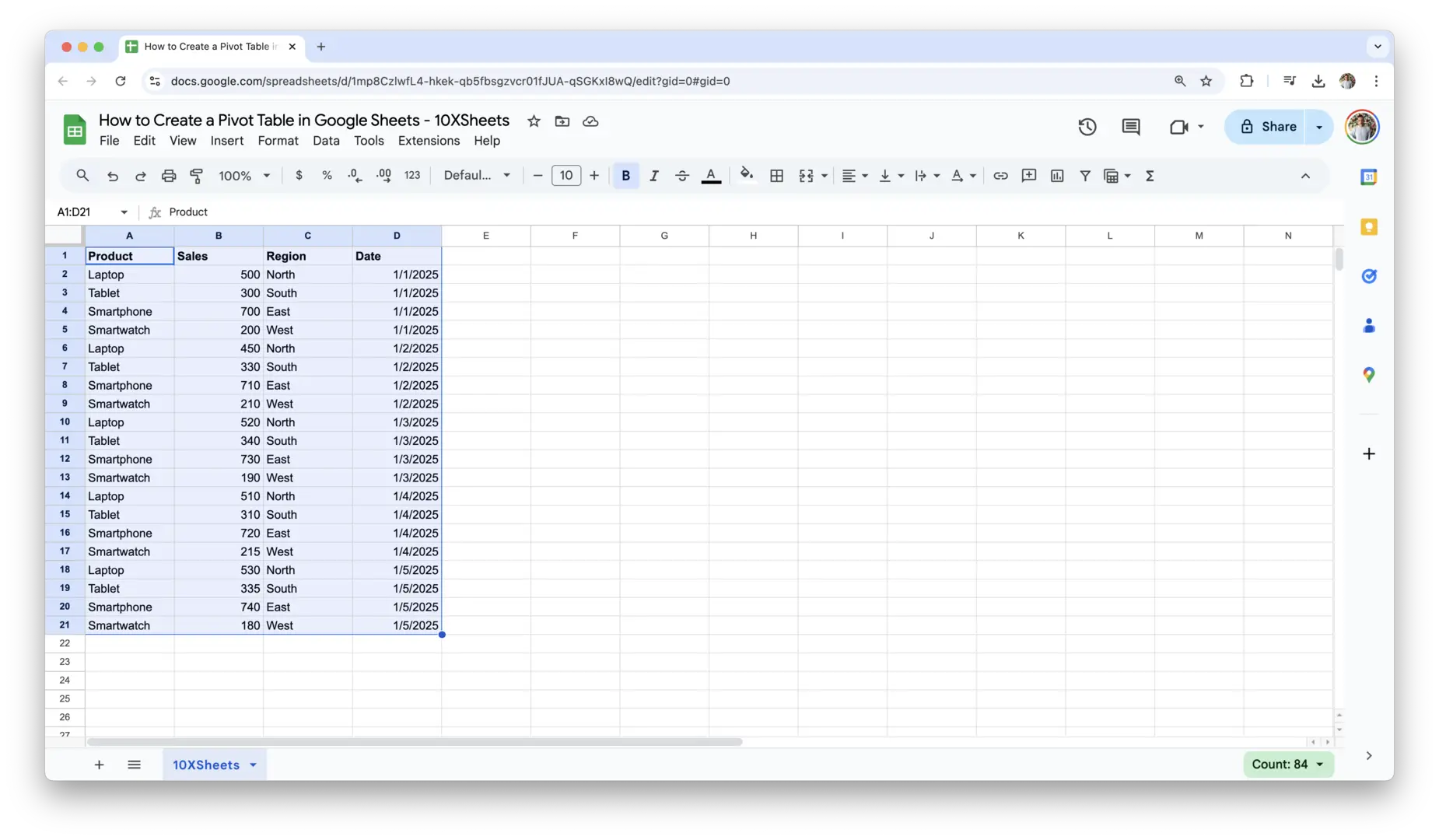
- Select Your Data: Highlight the range of data you want to include in your pivot table. This could be a small dataset, or it could be a larger dataset, such as sales figures for an entire year. If you are unsure about the range, you can also select the entire sheet, and Google Sheets will automatically detect the boundaries of your data.
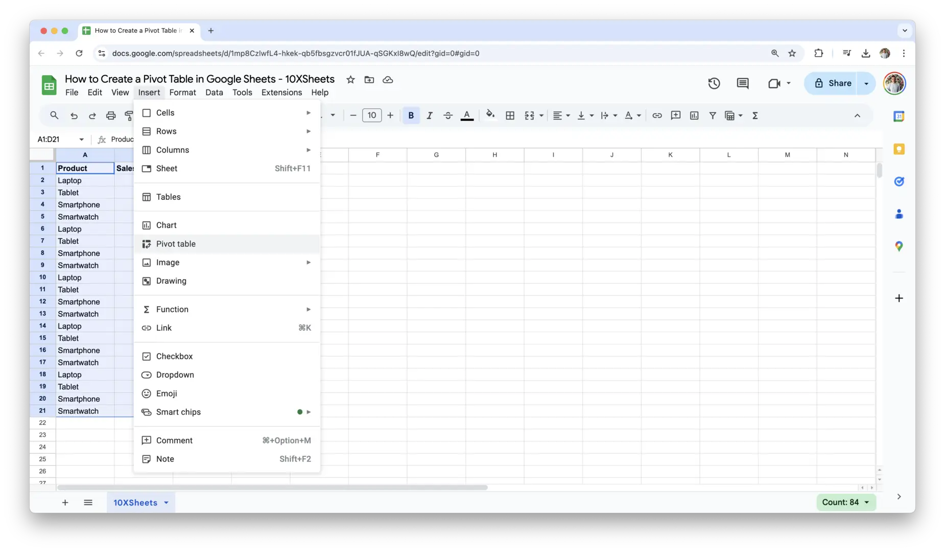
- Insert the Pivot Table:
- Go to the Insert menu in the top toolbar of Google Sheets.
- From the dropdown menu, click Pivot table.
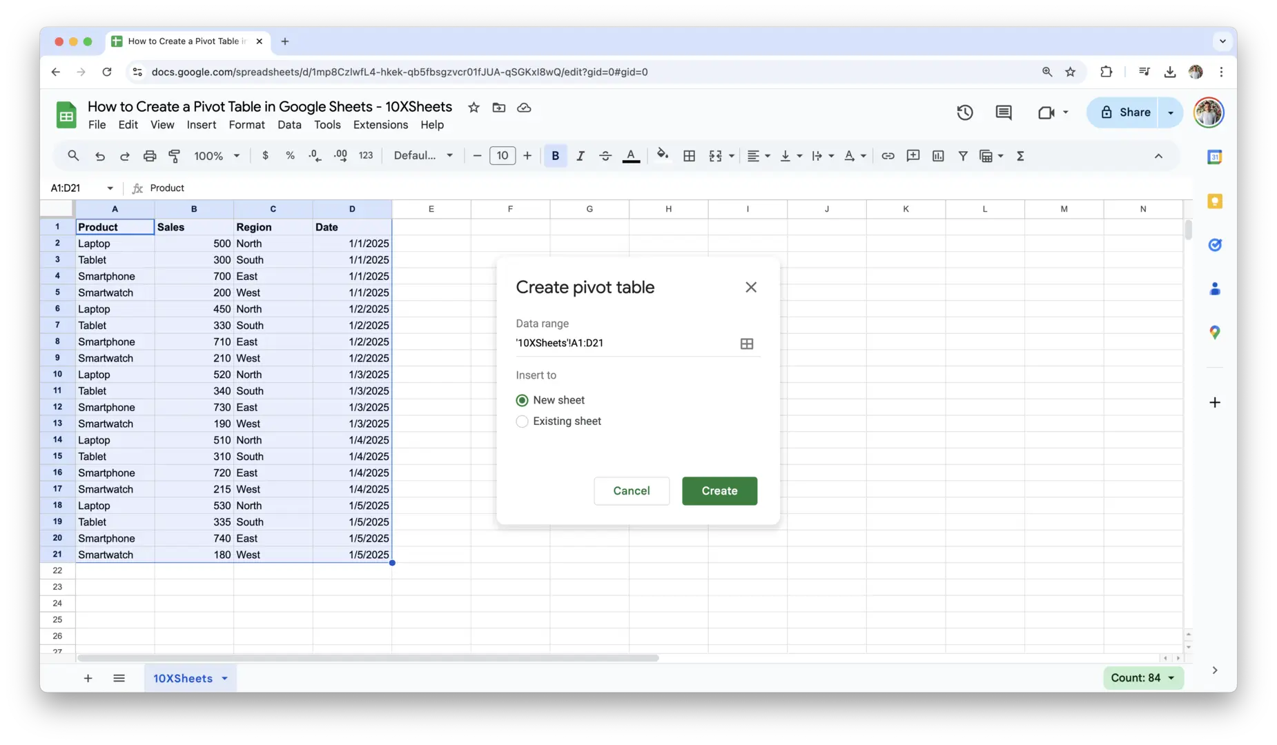
- A prompt will appear, asking if you want to create the pivot table in a new sheet or in the existing sheet. Generally, it’s best to create it in a new sheet to keep things organized.
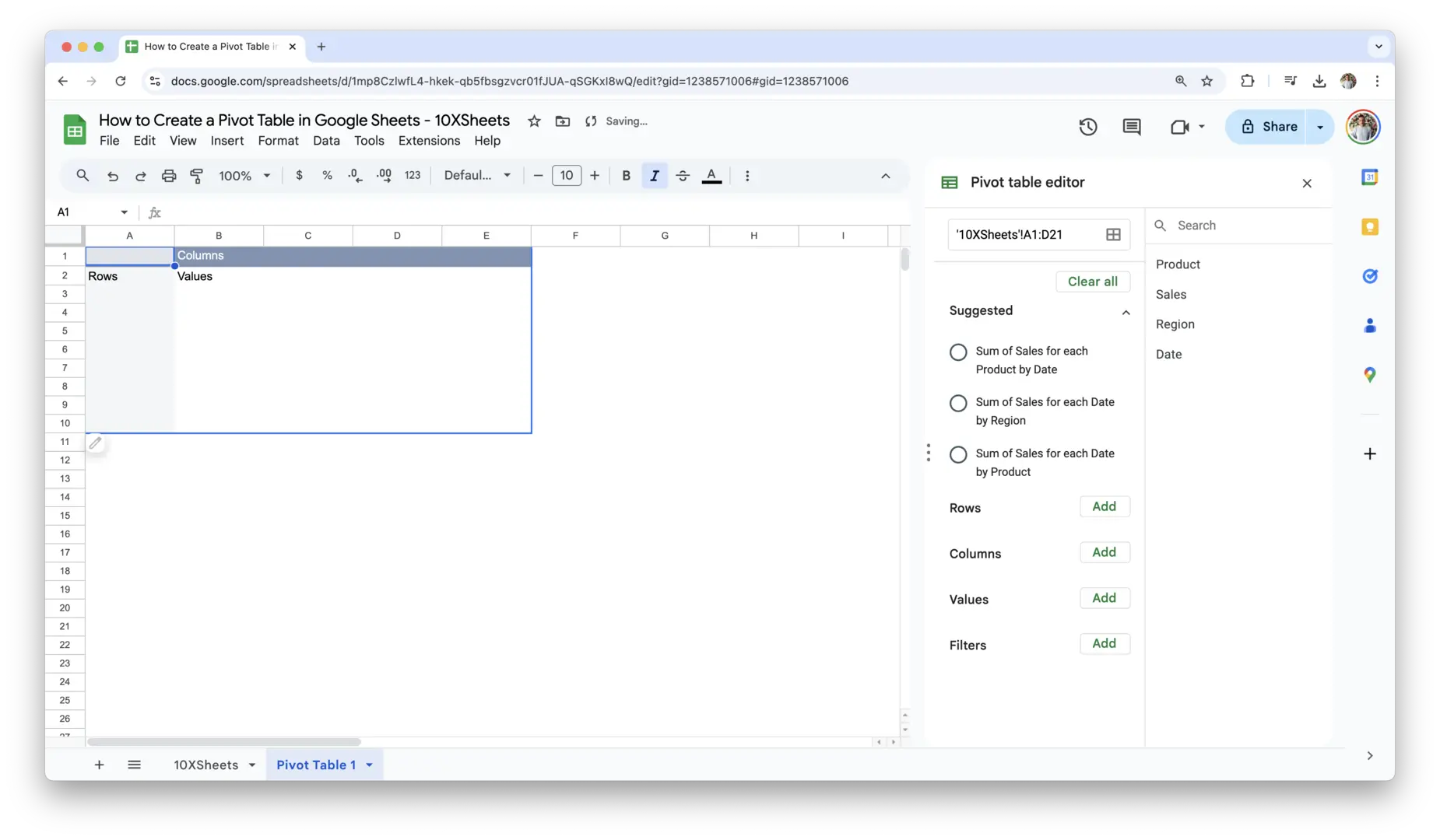
- Click Create, and a new sheet will open with an empty pivot table and the Pivot Table Editor on the right.
- Start Building Your Pivot Table: Once you’ve clicked “Create,” the pivot table editor will be on the right side of the screen, but the table itself will be blank. Now, you can start adding fields from your dataset to the different sections of the editor (Rows, Columns, Values, Filters) to customize your pivot table.
Once you’ve set up the basic structure of your pivot table, you’ll begin seeing the data displayed in a much more organized and insightful way.
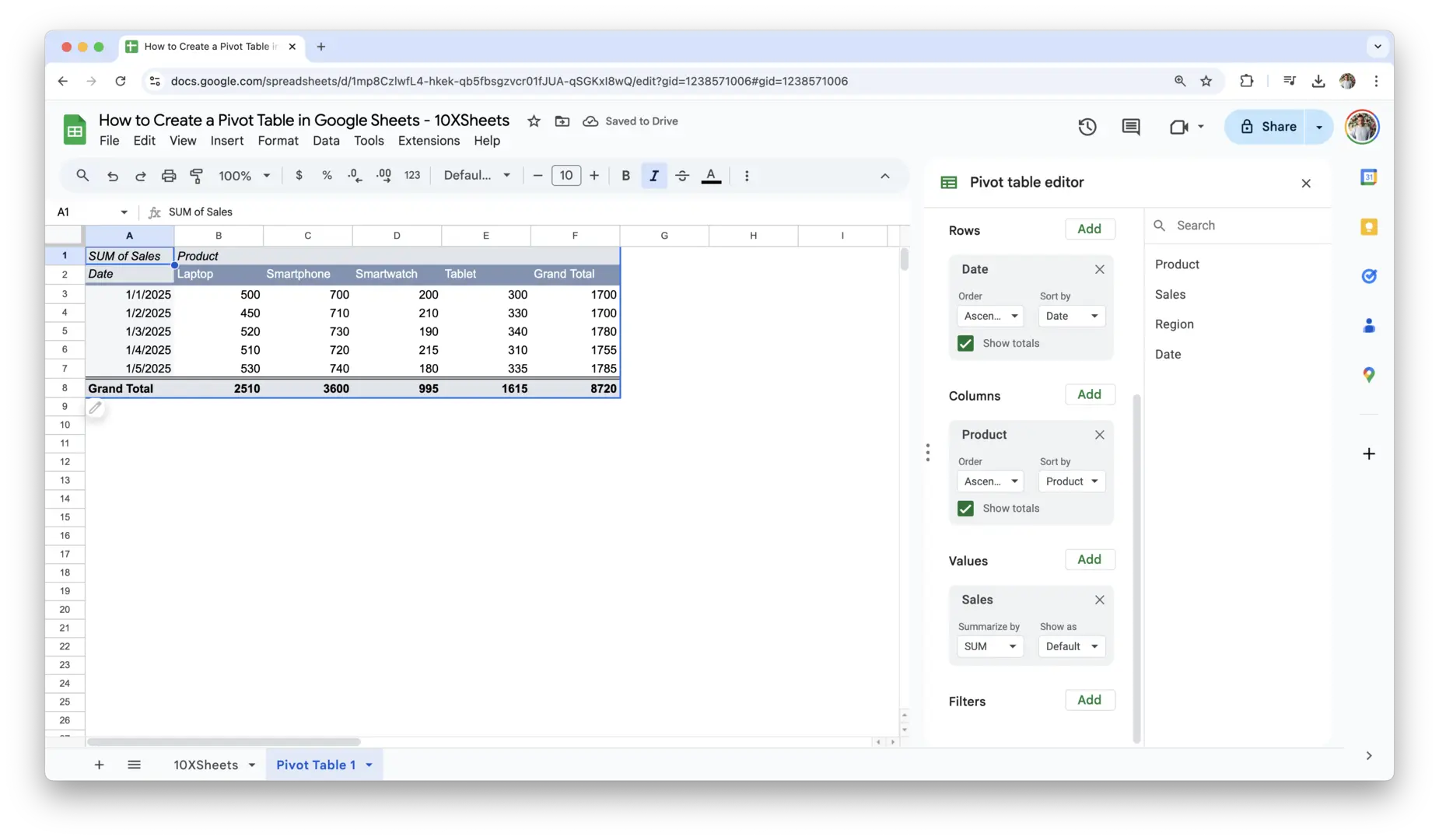
2. Navigate the Pivot Table Editor
The Pivot Table Editor is where the magic happens. It’s where you can customize your pivot table by dragging and dropping fields into different areas. Understanding how to navigate the editor and use its features will help you get the most out of your pivot table. Here’s a breakdown of the main areas in the editor:
- Rows and Columns: In the editor, you’ll see sections for Rows and Columns. These are where you drag the fields (like “Product” or “Region”) that you want to categorize your data by. Rows will appear as vertical labels, and columns will display horizontally, so think about how you want to organize your data when adding fields here.
- Values: This is where your data will be summarized. For example, if you’re looking at sales, you could drag the “Sales Amount” field into the Values section. This area calculates aggregates such as sum, average, count, or other types of calculations based on the data.
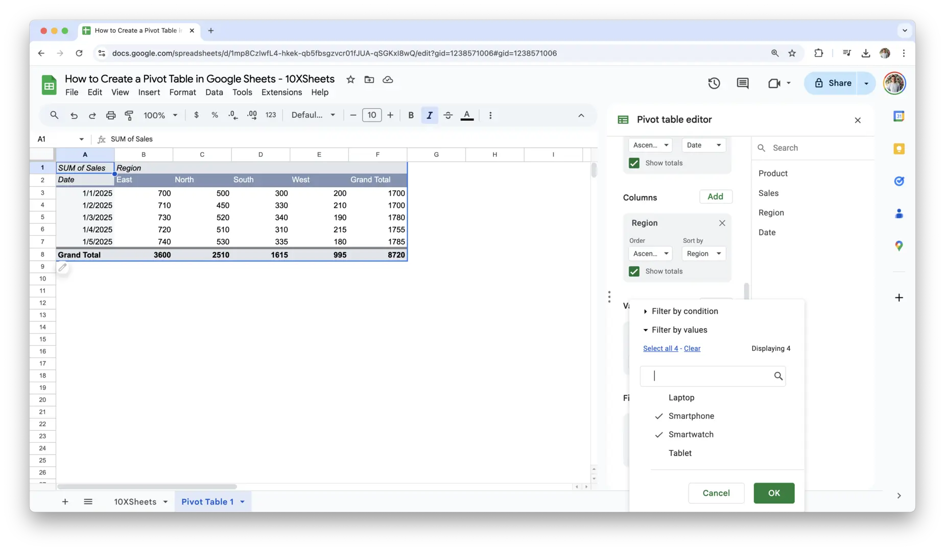
- Filters: Filters let you focus on specific subsets of your data. If you have a large dataset and want to narrow it down—for example, looking at data only for a particular time period or region—you can add a field to the Filters section and choose the criteria you want.
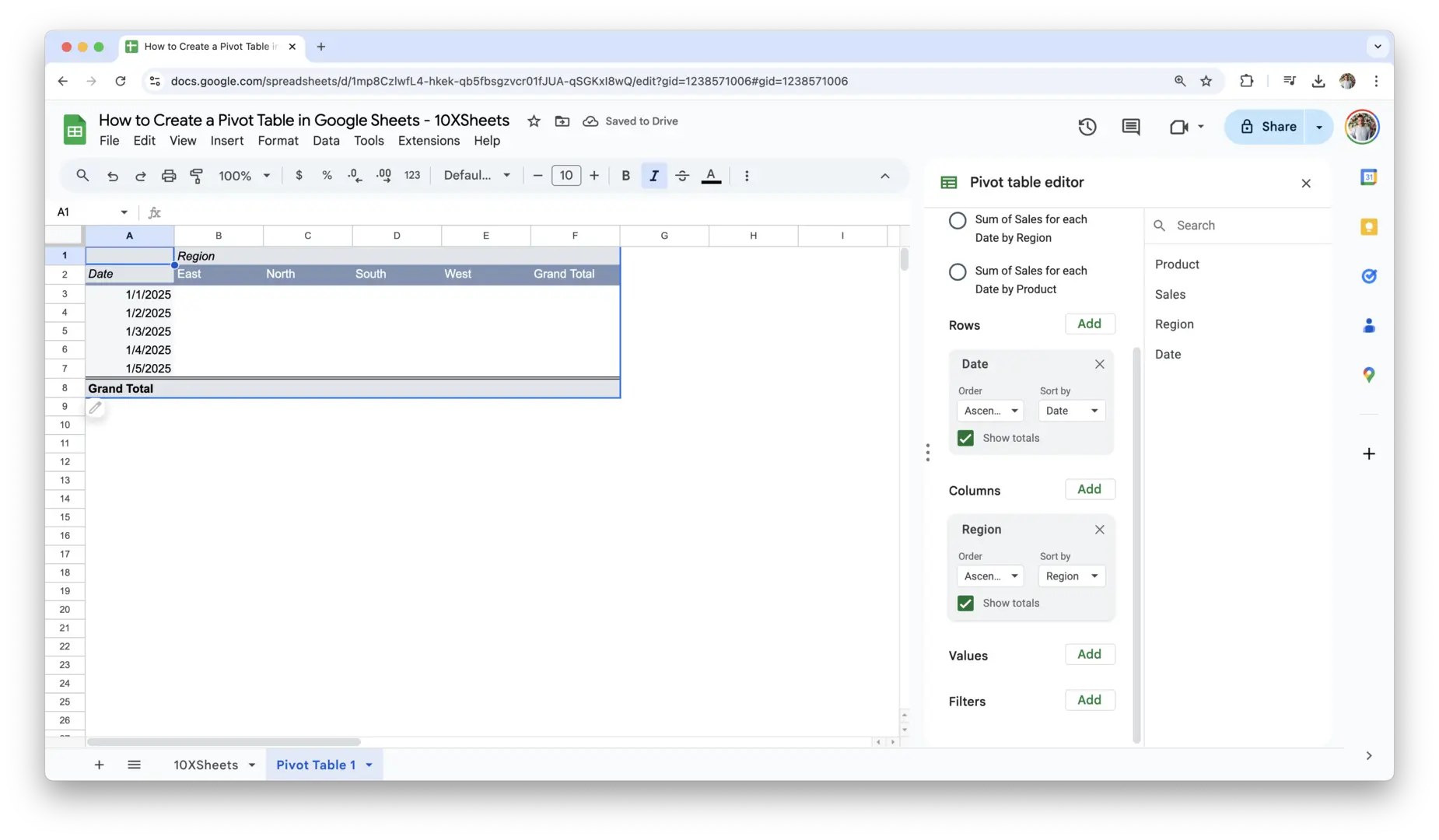
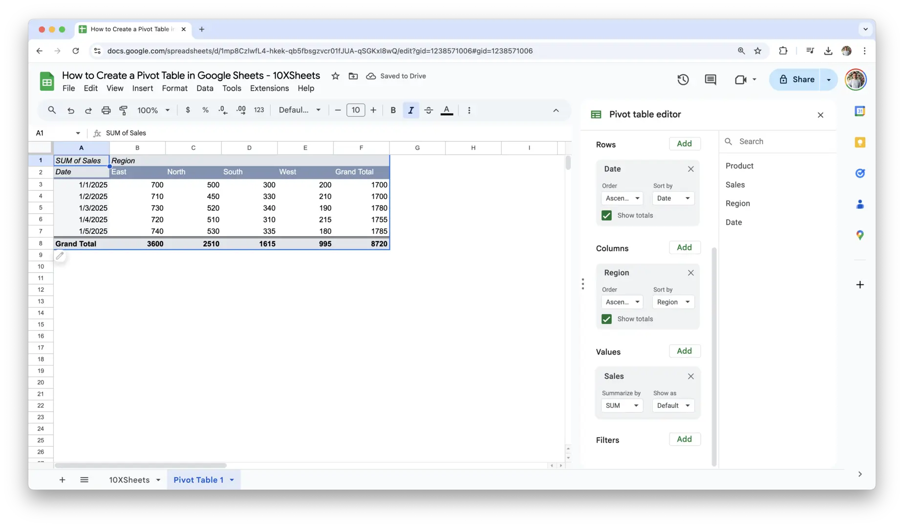
The Pivot Table Editor is intuitive and dynamic, meaning you can drag fields around to experiment with different views of your data. Don’t be afraid to explore and try out different combinations to see how the data shifts. Every change you make will instantly update the pivot table, so you can see the impact of your selections in real-time.
3. Understand the Data Structure for Pivot Tables
For a pivot table to work efficiently, it’s crucial that your data is well-structured from the start. The better your data is organized, the more easily you can summarize and analyze it in a pivot table. Here’s what you should keep in mind when preparing your data:
- Flat Data Structure: Your data should be in a flat format, meaning every column should represent a single variable (such as “Product,” “Sales Amount,” or “Region”). Each row should represent a unique entry, like a sales transaction or customer record. Avoid nested or hierarchical data, as it will make it difficult to summarize and analyze in a pivot table.
- No Merged Cells: Pivot tables work best when there are no merged cells in your data range. Merging cells can create confusion and make it harder for the pivot table to interpret your data correctly. Ensure all rows and columns are consistent and aligned.
- Column Headers Are Essential: Each column in your data should have a unique header that clearly describes the data below it. For example, instead of just writing “Amount,” use a more descriptive header like “Sales Amount” or “Revenue.” This will help the pivot table understand the context of your data.
- Consistent Data Types: Make sure that each column contains only one type of data. For instance, don’t mix dates with text or numbers with text in the same column. Having consistent data types in each column ensures the pivot table can aggregate and analyze the data correctly.
- Avoid Empty Rows or Columns: Empty rows or columns within your data range can cause issues with pivot tables, making them harder to create or causing them to malfunction. Keep your data clean by removing any unnecessary empty rows or columns before you create your pivot table.
By setting up your data correctly, you’ll avoid common pitfalls and ensure your pivot table will perform as expected. This preparation is the foundation of creating effective and insightful pivot tables. The cleaner and more structured your data, the better the pivot table results will be.
How to Customize Your Pivot Table in Google Sheets?
Once you’ve created your pivot table and set up the basics, it’s time to customize it. Pivot tables are incredibly versatile, and knowing how to adjust their layout and format will help you create reports that are both clear and visually engaging. Whether you’re adding more data points, adjusting the layout, or experimenting with different views, the customization options are endless.
Changing the Layout and Format
One of the most important ways to customize your pivot table is by adjusting its layout and format. Pivot tables allow you to easily rearrange rows, columns, and values to explore your data from different angles.
- Switching Rows and Columns: Sometimes, simply swapping the rows and columns can offer a completely new perspective on your data. For example, if you initially set “Product” as the rows and “Month” as the columns, switching them around will show you sales performance by month rather than by product. This can help reveal different patterns in your data.
- Resizing Cells: Pivot tables often display large amounts of data, so adjusting the width of columns and the height of rows is key for improving readability. You can resize cells by clicking and dragging the edges of the row numbers and column letters to make sure the text fits properly. This is especially important if you have long text labels in the pivot table.
- Formatting Numbers: Pivot tables automatically apply basic formatting, but you can further customize the way numbers are displayed. For instance, if you’re analyzing financial data, you might want to format numbers as currency. To do this, simply select the values in the pivot table and choose the format you prefer from the toolbar (such as currency, percentage, or number with commas).
- Applying Bold and Color: Make key figures stand out by applying bold text or changing the background color of cells. You can highlight important metrics (like total sales or profit) by changing the font style or background color. This visual emphasis can draw attention to the most critical parts of your report.
Adding Multiple Dimensions and Measures
Pivot tables are flexible enough to allow you to display multiple dimensions and measures at the same time. This makes them a powerful tool for comparing and contrasting different data points within a single view.
- Adding Multiple Rows or Columns: You can add more than one field to the Rows or Columns section to compare several variables simultaneously. For example, you might use “Product” as the first row and then add “Region” as a second row. This will break down your sales data not only by product but also by region, making it easier to identify trends in specific geographic areas.
- Adding Multiple Values: You can also add more than one measure to the Values section. For example, instead of just displaying total sales, you could also display the average sales price or the number of transactions. This allows you to analyze different metrics side by side, providing a more comprehensive view of your data.
- Layering Measures: If you want to compare different calculations, such as comparing revenue and profit margins, you can layer them in the Values section. For example, place “Revenue” and “Profit” next to each other to compare them at a glance. This gives you a more holistic picture of your business performance.
Grouping Data by Date, Text, or Numeric Ranges
Another great customization feature in pivot tables is the ability to group data. Grouping allows you to combine data into categories, making it easier to analyze.
- Date Grouping: If you have date data in your table, Google Sheets will allow you to group it by day, month, quarter, or year. This is particularly helpful if you want to see how data trends over time. For example, instead of viewing sales data for each individual day, you can group by months or quarters to observe broader patterns.
- Grouping Numeric Data: You can group numbers into ranges to better understand distribution. For example, you might want to group sales figures into ranges such as “$0-$100”, “$101-$500”, and “$501-$1000.” This is helpful for spotting patterns in your data, such as determining how many customers fall into specific sales brackets.
- Text Grouping: In some cases, grouping by text can also be useful. If you have categorical data, like “Region” or “Product Category,” you can group similar categories together for easier analysis. This way, you can aggregate related items without manually sorting through each category.
Sorting and Filtering Pivot Table Data
Sorting and filtering your pivot table data is crucial for isolating the most important information. With the right sorting and filtering settings, you can tailor your pivot table to show only the data that matters most.
- Sorting Data: Google Sheets makes it easy to sort data in ascending or descending order. Whether you’re sorting by totals (e.g., the highest sales first) or alphabetically (e.g., by product name), sorting helps to prioritize and highlight the most significant data points. You can sort both rows and columns depending on how you want your data to appear.
- Applying Filters: Filters are a fantastic way to narrow down the data shown in your pivot table. You can filter by any of the fields in your dataset, whether it’s filtering by a specific region, date range, or product. This allows you to focus on specific subsets of your data, making your analysis more targeted and relevant. Filters can also be combined, so you can narrow down by multiple criteria at once.
Advanced Google Sheets Pivot Table Features
Once you’re comfortable with the basics, it’s time to explore the more advanced features that pivot tables offer. These features can help you create even more dynamic and insightful reports, giving you deeper control over your data analysis.
Calculated Fields and Items
Calculated fields allow you to create custom calculations within your pivot table. These fields are especially useful when you want to perform complex calculations that go beyond the built-in aggregation functions like SUM or AVERAGE. For example, if you have fields for “Revenue” and “Cost,” you can create a calculated field to show “Profit” by subtracting Cost from Revenue.
To add a calculated field:
- In the Pivot Table Editor, click “Add” under the Values section and choose “Calculated field.”
- Then, enter your formula using the existing fields in your table. For example, you could enter a formula like
=Revenue - Costto calculate profit.
Calculated items work similarly, but they allow you to create new data points by manipulating existing row or column data. For instance, you can calculate the total sales of multiple products in one row to get a combined figure.
Using Slicers for Dynamic Filtering
Slicers are an excellent feature that provides a more interactive experience when working with pivot tables. A slicer is a clickable filter that allows users to dynamically select the data they want to see. Instead of manually adjusting filters within the Pivot Table Editor, you can add a slicer to your report, which lets you filter the data by selecting options from a dropdown or a set of buttons.
Slicers are particularly useful when you want to allow others (or yourself) to quickly change the view of the pivot table without modifying the table itself. For example, you could add a slicer for “Region,” so users can select which region’s sales data to display in the pivot table.
Working with Multiple Data Sources (Combining Sheets)
Sometimes, your data is spread across multiple sheets or even multiple files. With Google Sheets, you can combine data from different sources into a single pivot table. This is particularly useful when you want to analyze data from different departments, regions, or time periods.
To combine data from multiple sheets, you can use the IMPORTRANGE function to pull data from other spreadsheets into your pivot table. Once the data is imported, you can analyze it just like you would any other dataset. This method is powerful for creating unified reports from various data sources, streamlining the analysis process.
Applying Conditional Formatting for Enhanced Insights
Conditional formatting is a tool that allows you to apply formatting to cells based on specific conditions or rules. This can be incredibly helpful for visually highlighting important trends or outliers in your pivot table.
For instance, you could use conditional formatting to:
- Highlight high and low values: Automatically color the highest sales figures in green and the lowest in red.
- Create data bars: Show data bars inside cells to represent the relative value of each entry visually.
- Add color scales: Use a gradient of colors to show values that range from low to high, making it easy to spot trends at a glance.
To apply conditional formatting, simply select the cells in your pivot table and choose “Conditional formatting” from the Format menu. You can set up rules for how the data should be displayed, such as choosing a color scale or applying custom formatting based on the value in the cell.
These advanced features enhance the flexibility and functionality of pivot tables, giving you more control over how your data is displayed and analyzed. By mastering these options, you can take your pivot table game to the next level and create even more powerful reports.
Google Sheets Pivot Tables Use Cases
Pivot tables are versatile and can be used for a wide range of tasks, from analyzing sales performance to tracking inventory and expenses. Their ability to summarize, aggregate, and manipulate data makes them invaluable tools for both business professionals and individuals looking to organize large datasets. Here are some practical use cases where pivot tables can truly shine.
Analyzing Sales Data
One of the most common applications of pivot tables is analyzing sales data. Sales teams, business analysts, and managers often use pivot tables to get a clear overview of performance, compare different time periods, and understand the breakdown of sales across various categories. With pivot tables, you can easily:
- Summarize total sales: By aggregating data on sales transactions, you can quickly get an overview of total sales for a given period, product, or sales representative.
- Analyze performance by product: With the ability to break down data by product, you can track which products are performing the best and identify trends. For example, a pivot table can show sales by product category or individual product, helping businesses focus their efforts on high-performing items.
- Compare performance over time: Pivot tables allow you to group sales data by time periods (such as by month, quarter, or year), making it easy to spot trends and seasonal fluctuations in your sales.
- Assess performance by region or salesperson: By adding geographic or sales representative information to the rows or columns, you can evaluate how different regions or individuals are performing, helping to identify areas for improvement or best practices to replicate.
With these insights, businesses can make data-driven decisions, plan marketing campaigns, and adjust sales strategies to optimize performance.
Tracking Inventory and Expenses
Another valuable use of pivot tables is for managing inventory and tracking expenses. Whether you’re running a small retail store or managing a large warehouse, pivot tables can help you maintain control over stock levels and keep track of spending.
- Monitor stock levels: Pivot tables can be used to analyze inventory data, showing how much of each product is in stock, how many units have been sold, and which products are running low. This helps you plan reordering and avoid stockouts or overstock situations.
- Identify slow-moving inventory: By grouping inventory data by product category or sales velocity, you can identify items that aren’t selling well. This can help inform decisions about discounts, promotions, or whether to phase out underperforming products.
- Track expenses: Just as you track inventory levels, pivot tables can be used to track expenses across categories, such as operational costs, payroll, and overhead. You can easily see where your money is going and identify opportunities for cost-saving measures.
- Compare actual versus budgeted expenses: With a pivot table, you can compare your actual spending against your budget. This allows you to quickly assess whether you’re staying within your financial limits or if adjustments are necessary to avoid overspending.
Using pivot tables for inventory and expense tracking not only helps keep your finances in check, but it also gives you a clear understanding of your business’s overall health.
Creating Reports for Financial or HR Data
For businesses and organizations, generating accurate and comprehensive reports is a routine necessity. Pivot tables are incredibly helpful for financial and HR data analysis, enabling easy access to key performance metrics and insights.
- Summarizing financial statements: Pivot tables can simplify the process of summarizing financial data such as income statements, balance sheets, and cash flow reports. By grouping data by categories like revenue, expenses, or assets, you can quickly generate reports that provide an overview of financial health.
- Tracking employee performance: HR departments can use pivot tables to track employee performance, attendance, and productivity metrics. By grouping data by employee or department, you can easily see which teams or individuals are excelling and which may need additional support.
- Payroll analysis: Pivot tables can also be used to track payroll expenses, comparing total wages, benefits, and bonuses across different departments or time periods. This makes it easier to prepare payroll reports and ensure that wages are within budget.
- Employee demographics: HR teams can use pivot tables to analyze employee demographics, such as age, gender, or length of service. This can help inform diversity initiatives or assess the workforce’s overall composition.
With pivot tables, financial and HR professionals can generate clear, actionable reports that provide insights into a company’s performance, helping managers and decision-makers make informed choices.
Troubleshooting Common Google Sheets Pivot Table Issues
Despite their usefulness, pivot tables can sometimes present challenges. Fortunately, most common issues can be resolved quickly with a few simple steps.
- Data not updating: Sometimes pivot tables don’t automatically update when the source data changes. To fix this, refresh your pivot table by clicking on any cell within the pivot table and selecting the refresh icon in the top right of the editor.
- Blank rows or columns in the pivot table: If your pivot table includes blank rows or columns, it may be due to inconsistencies in the source data, such as empty cells or merged cells. Ensure that your source data is clean and that there are no blank spaces within the dataset.
- Incorrect aggregation: If your pivot table isn’t calculating data correctly, check that the aggregation function (like SUM or AVERAGE) is correctly set in the Values section of the editor. You may need to adjust this if you want to calculate different metrics or use a custom formula.
- Grouping issues: When trying to group data (especially dates), make sure the data is in a consistent format. Google Sheets may struggle to group dates if they are not formatted correctly (e.g., mixing text and date formats in the same column).
- Wrong field placement: If your pivot table is not displaying the data as expected, check the arrangement of fields in the Rows, Columns, Values, and Filters sections. Sometimes, simply switching fields between Rows and Columns or adjusting filters can provide the view you need.
- Pivot table too slow to load: Large datasets can sometimes cause pivot tables to load slowly. To improve performance, try reducing the amount of data included in your pivot table by filtering out unnecessary columns or rows.
- Formula errors: If you are using calculated fields and get an error, ensure that the formula is correctly referencing the right fields and that all parentheses and operators are used properly. Double-check the formulas to ensure accuracy.
By addressing these common issues, you can ensure your pivot tables are running smoothly and providing the insights you need. Troubleshooting is a part of the process, and once you become familiar with the typical issues, you’ll be able to resolve them quickly.
Conclusion
Pivot tables are a powerful tool in Google Sheets that can save you a lot of time and effort when analyzing large datasets. Whether you’re summarizing sales, comparing performance, or tracking expenses, pivot tables give you the flexibility to view your data from different angles with just a few clicks. They’re designed to be easy to use, so even if you’re not a data expert, you can quickly get the hang of it. The more you experiment with the features, like grouping, sorting, and filtering, the more you’ll discover just how much they can simplify your analysis and help you uncover valuable insights.
As you continue working with pivot tables, you’ll find that they’re not just for simple tasks but can be used in more advanced ways too. From calculated fields to dynamic slicers, the possibilities are endless. The key is to practice and explore how different configurations can reveal patterns and trends you might have missed. So, the next time you have a dataset to analyze, try using a pivot table—you might be surprised at how much more efficient and insightful your analysis can become.
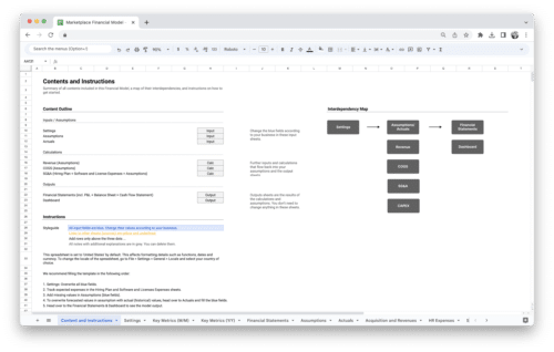
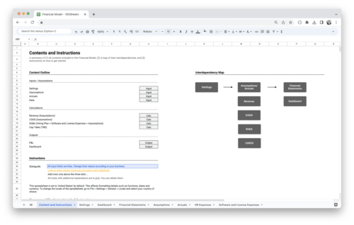
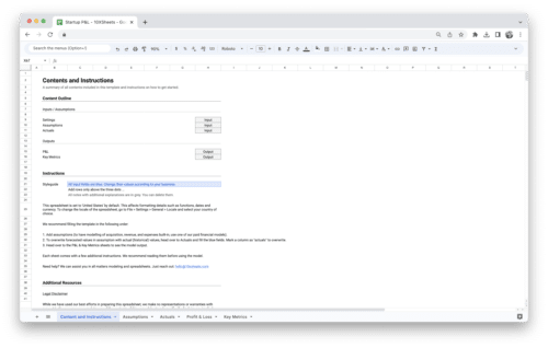
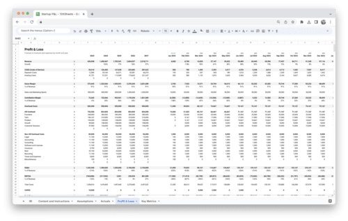
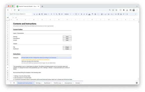
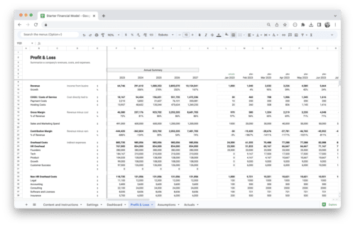
Get Started With a Prebuilt Template!
Looking to streamline your business financial modeling process with a prebuilt customizable template? Say goodbye to the hassle of building a financial model from scratch and get started right away with one of our premium templates.
- Save time with no need to create a financial model from scratch.
- Reduce errors with prebuilt formulas and calculations.
- Customize to your needs by adding/deleting sections and adjusting formulas.
- Automatically calculate key metrics for valuable insights.
- Make informed decisions about your strategy and goals with a clear picture of your business performance and financial health.