Do you want to make your data more understandable and visually appealing? Creating graphs in Google Sheets is an easy way to turn numbers into clear, insightful visuals. Whether you’re working with sales data, survey results, or anything in between, graphs can help you see patterns, trends, and comparisons at a glance. In this guide, you’ll learn everything you need to know about making graphs in Google Sheets—from organizing your data to customizing your chart for maximum impact. It’s simple, quick, and a great way to make your data shine.
What are Graphs in Google Sheets?
Google Sheets is more than just a tool for storing data; it’s a powerful platform for analyzing, organizing, and presenting data in visually meaningful ways. With built-in features for creating a variety of graphs and charts, Google Sheets allows users to transform raw data into intuitive visual representations, making complex information easier to digest and share.
The platform supports a wide range of graph types, including bar charts, line graphs, pie charts, scatter plots, and more, allowing you to choose the best chart for your specific dataset. Google Sheets also provides a seamless experience for customization, ensuring your graphs not only look professional but also communicate the right message.
Benefits of Visualizing Data Through Graphs
- Improved data comprehension: Graphs provide a clear visual summary of data, allowing you to quickly spot trends, patterns, and outliers that might be difficult to identify in raw numbers alone.
- Effective communication: Visualizations help convey complex information to a broader audience, making it easier to explain data-driven insights in meetings, reports, or presentations.
- Faster decision-making: By highlighting important trends and data points, graphs enable faster and more informed decision-making. Instead of sifting through pages of data, decision-makers can quickly interpret visual summaries.
- Enhanced analysis: Graphs make it easier to compare multiple data points, track changes over time, or visualize the relationships between different variables, facilitating more robust analysis and insights.
- Increased engagement: Well-designed graphs capture attention and keep viewers engaged. When data is presented in a visually appealing way, it is more likely to be understood and remembered.
By using graphs in Google Sheets, you can leverage these benefits to make your data work harder for you, turning it into a tool for clear communication and smarter decision-making.
How to Prepare Your Data?
Before diving into graph creation, it’s essential to ensure your data is ready to be visualized. Well-organized, clean data will lead to clearer, more accurate graphs. Here’s how you can prepare your data for graphing:
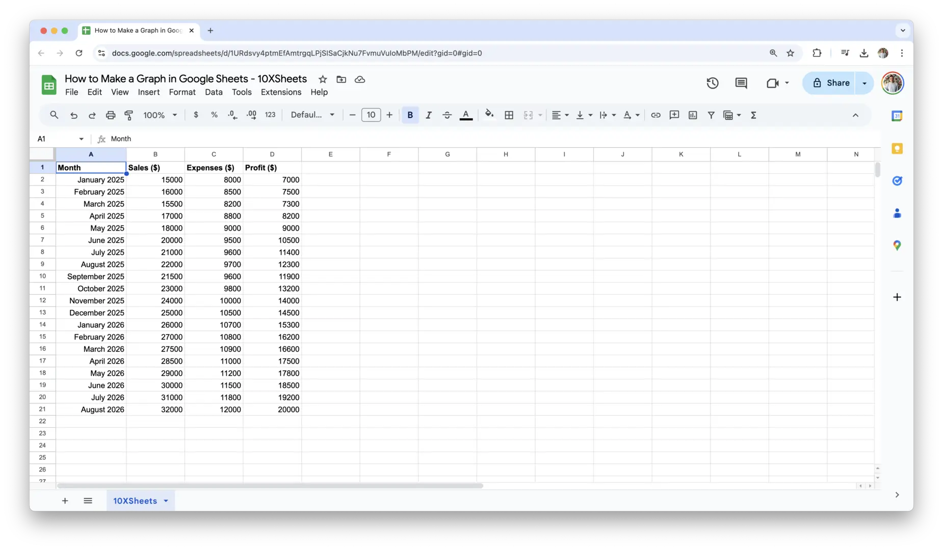
- Make sure your data is organized in a tabular format with labels in the first row or column. For example, have one column for dates and another for numerical values like sales or expenses.
- Remove any unnecessary or irrelevant data. Only include the data that you intend to visualize.
- Check for consistency in your data types (e.g., numbers should be in numerical format, dates in date format). This will prevent errors when generating the graph.
- Eliminate any blank cells within your data range. Blank cells may confuse Google Sheets, causing your chart to display incorrectly.
- Ensure that your data is free of duplicates. Redundant data can skew the results of your graph and make it harder to interpret.
- If you’re using categories, make sure each category has a corresponding value. Mismatched categories and values can cause the graph to misrepresent the data.
- If necessary, sort your data to make it easier to read and interpret once it’s turned into a graph, such as sorting dates in chronological order or values from highest to lowest.
With your data set properly prepared, you can confidently move forward with creating a graph that accurately reflects the information you want to display.
How to Choose the Right Graph Type?
Choosing the right graph type is a critical step in presenting your data clearly and effectively. Google Sheets offers several chart options, each suited to different types of data. Selecting the appropriate one depends on what you want to communicate and how you want your audience to interpret the data.
Different Types of Graphs
Each graph type in Google Sheets is designed for a specific kind of data visualization, making it easier to highlight trends, compare categories, or show relationships between variables. Let’s look at some of the most common types:
- Bar Chart: A bar chart uses rectangular bars to represent data. Each bar’s length is proportional to the value it represents. It’s ideal for comparing different categories side by side, making it easy to see which category is the highest or lowest. Bar charts can be vertical or horizontal, and the layout you choose depends on your data and preference.
- Line Chart: Line charts are great for showing data points connected by straight lines, helping to visualize trends over time. These are especially useful when you want to track progress or patterns, like revenue growth over several months or temperature changes throughout a year.
- Pie Chart: Pie charts represent parts of a whole. Each slice of the pie corresponds to a category’s percentage of the total. Pie charts are best used when you want to illustrate how individual pieces contribute to the whole, such as the distribution of expenses or market share among companies.
- Scatter Plot: A scatter plot is used to display the relationship between two variables. Each point on the graph represents an individual data point, and by looking at the distribution of these points, you can spot correlations or trends. This type is most useful when you want to see how two different metrics relate, like the correlation between marketing spend and sales.
- Column Chart: Similar to bar charts but with vertical bars, column charts are commonly used to compare data across categories. They are particularly effective when you want to emphasize the differences in values between categories, such as comparing quarterly earnings.
Each of these chart types can be customized to suit your data, but it’s essential to choose the one that will make your message clear and easy to understand.
How to Decide Which Graph Type Best Represents Your Data
To decide which graph to use, you first need to consider the nature of your data and what you’re trying to communicate. For example:
- Comparing Categories: If you want to compare values across different categories, such as sales by region or revenue by product, a bar chart or column chart is ideal. Bar charts are especially helpful when you have longer category labels or multiple categories to compare.
- Showing Trends Over Time: When tracking changes over time, like website traffic or monthly sales performance, a line chart is the best choice. This allows you to visualize patterns and identify upward or downward trends.
- Illustrating Proportions: If you need to show how parts of a whole relate to each other, a pie chart works best. It’s most effective when you’re displaying percentages, like the breakdown of market share or budget allocation.
- Identifying Relationships: To analyze the correlation between two variables, such as hours worked vs. productivity or advertising spend vs. sales, a scatter plot will help you understand the relationship. Scatter plots can reveal whether an increase in one variable leads to an increase or decrease in another.
Factors to Consider When Choosing a Graph Type
When selecting a graph, keep a few important factors in mind to ensure your chart effectively communicates your message:
- Data Structure: The structure of your data often dictates the type of graph you should use. If you have continuous data, such as dates or time series, a line chart works well. If your data is categorical, like survey responses or product types, a bar or pie chart is usually better. For more complex data with multiple variables, scatter plots or even multi-axis charts might be more suitable.
- Audience: Consider who will be viewing your graph. If your audience is unfamiliar with your data or is not highly technical, you may want to use simpler graphs like bar or pie charts. If your audience is more data-savvy and familiar with complex datasets, you might opt for scatter plots or trend lines that provide deeper insights.
- Purpose: What do you want your graph to achieve? If your goal is to highlight trends, a line chart will be most effective. If you want to make comparisons, a bar or column chart works better. For demonstrating proportions or parts of a whole, a pie chart is the most straightforward choice.
By taking these factors into account, you’ll be able to select a graph type that not only represents your data accurately but also makes it easier for your audience to draw meaningful insights from it.
How to Create a Graph in Google Sheets?
Now that you have your data organized and you’ve chosen the right graph type, it’s time to create your graph. Google Sheets offers an intuitive and easy-to-use chart tool that helps you transform your data into a visual representation in just a few simple steps. Whether you’re creating a basic chart or preparing a customized one, the process is quick and straightforward.
1. Select Your Data
Before you can create a graph, you need to select the data that you want to visualize. The data should include both the labels (like dates, categories, or names) and the numerical values you want to represent.
Here’s how you can select your data:
- Open your Google Sheets document: Make sure your data is laid out in rows and columns, with labels in the first row or column (for example, months in one column and sales numbers in the next).

- Highlight the relevant data: Click and drag over the cells containing the data you want to include in the graph. This should include both your labels and the corresponding values. For instance, if you’re tracking sales by month, highlight both the months and the sales figures.
- Ensure the data is correctly formatted: Double-check that your numbers are in the correct format (e.g., currency, percentages). Misformatted data can cause issues with your graph, such as incorrect axis scales.
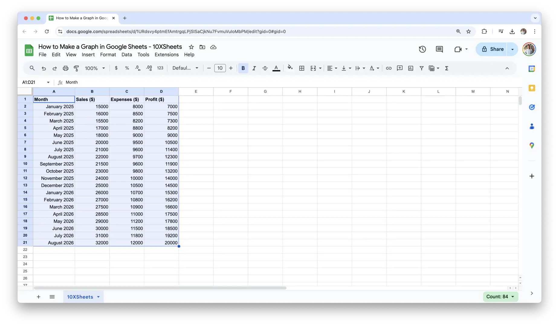
Once you’ve selected the data, you’re ready to move on to inserting your graph.
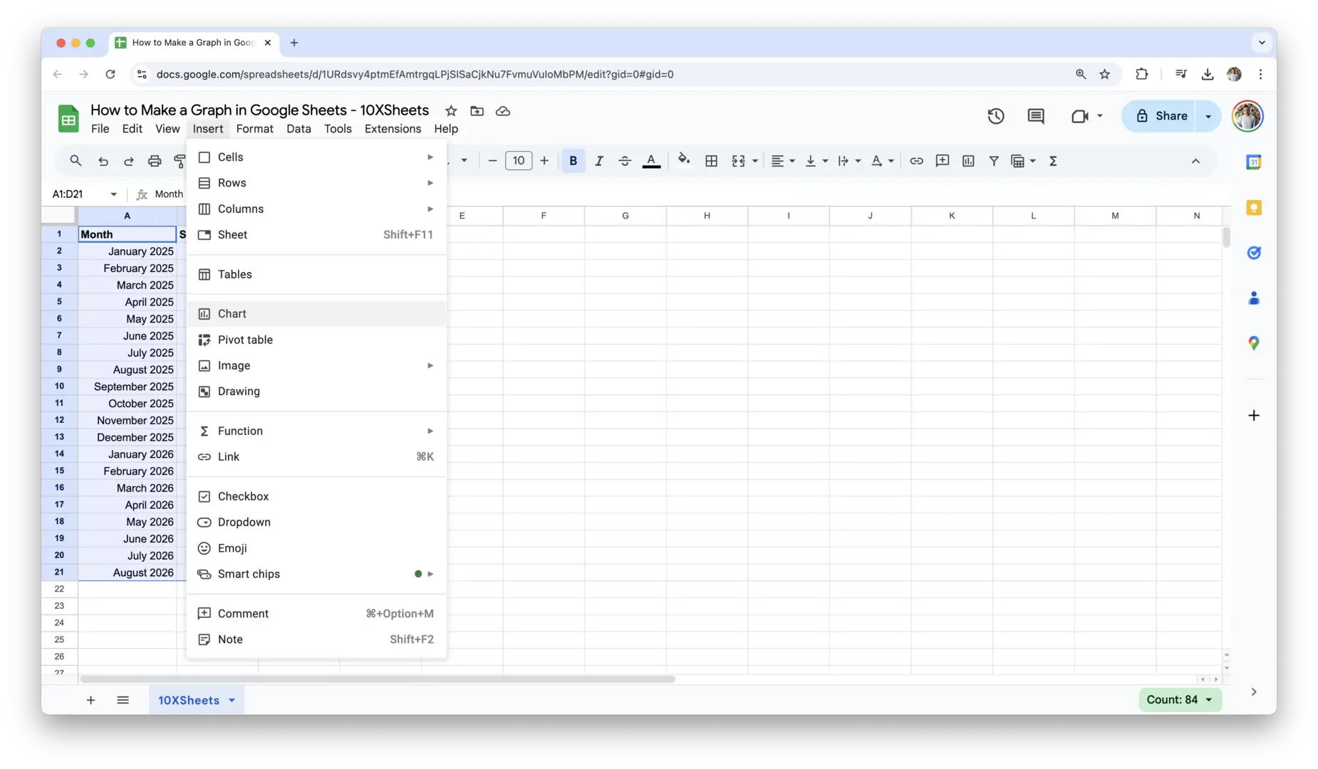
2. Insert a Graph Using the Chart Tool
Now that your data is ready, you can insert your graph. Google Sheets makes this process easy with the built-in chart tool. Follow these steps to insert your graph:
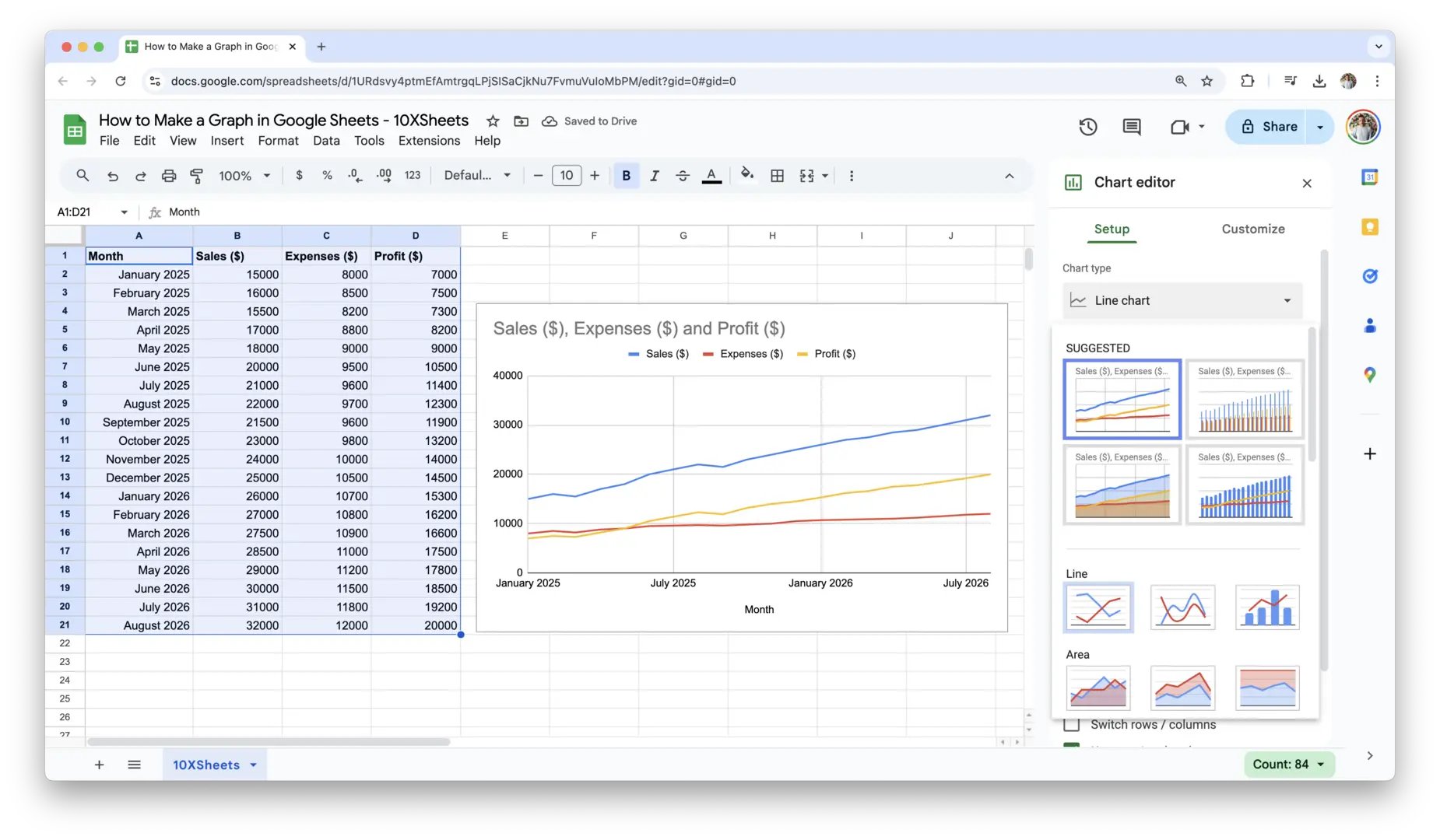
- Go to the menu and select Insert: In your Google Sheets document, navigate to the top menu bar and click on Insert. From the drop-down menu, select Chart. Google Sheets will automatically generate a default chart based on the selected data.
- Choose the graph type: After selecting Chart, Google Sheets will display a chart on your sheet. By default, it may choose a chart type that it thinks best suits your data (usually a column chart or bar chart). If you want to change the graph type:
- Click on the chart, and a Chart Editor will appear on the right side of the screen.
- Under the Setup tab, click the dropdown menu next to Chart type. Here, you can select from a variety of chart types such as bar, line, pie, scatter, and more, depending on your earlier decision about the graph type.
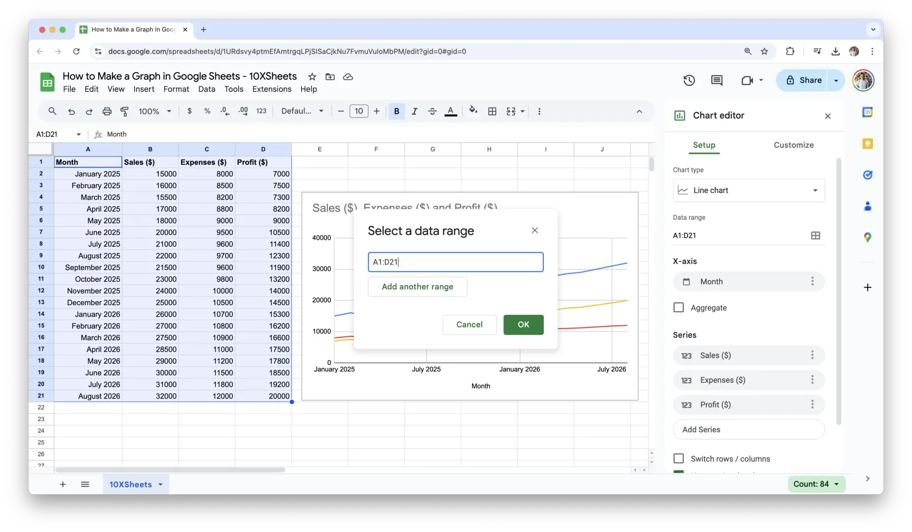
- Adjust the data range if necessary: If the chart doesn’t display the data you want, or if you need to adjust the data range, click on Data Range in the Chart Editor and manually adjust it. This is helpful if you accidentally included extra rows or columns in your initial selection.
Once your graph is inserted, it will automatically display on your Google Sheets document. But you’re not done yet. You can customize it further to make it more readable and visually appealing.
3. Customize Your Graph’s Basic Elements
Customizing your graph ensures that it clearly communicates the message you want to send. You can modify the basic elements of your graph, such as the title, axis labels, colors, and more. This is where you have the flexibility to make the chart truly your own.
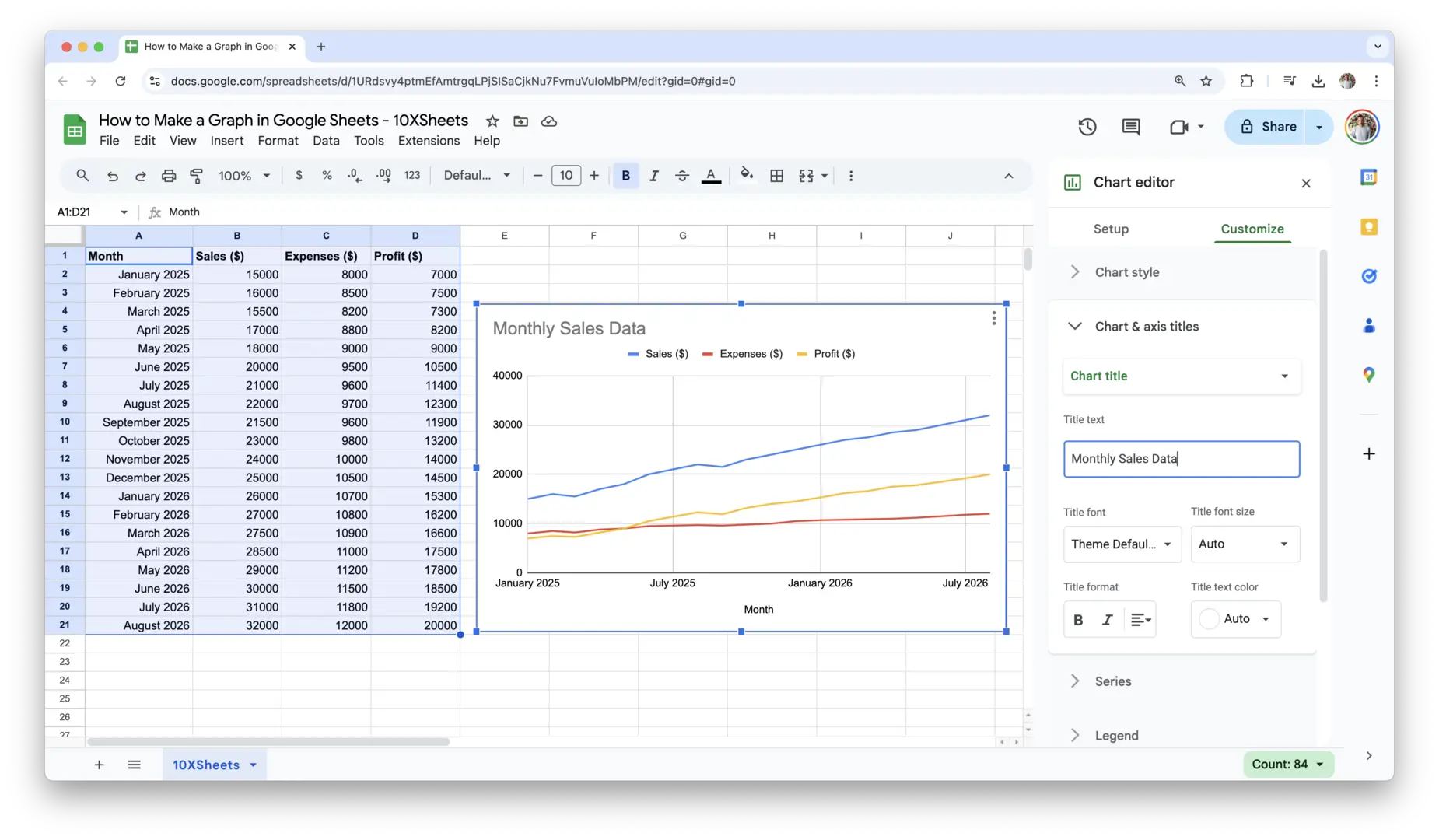
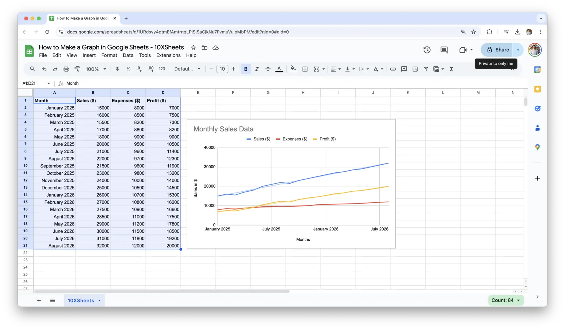
- Add a Chart Title: A good title helps your audience understand the context of the graph at a glance. To add or change the title:
- In the Chart Editor, click on the Customize tab.
- Under Chart & axis titles, click on Title Text and enter a descriptive title for your chart (e.g., “Monthly Sales Data”).
- You can also adjust the font size and style to make the title stand out.
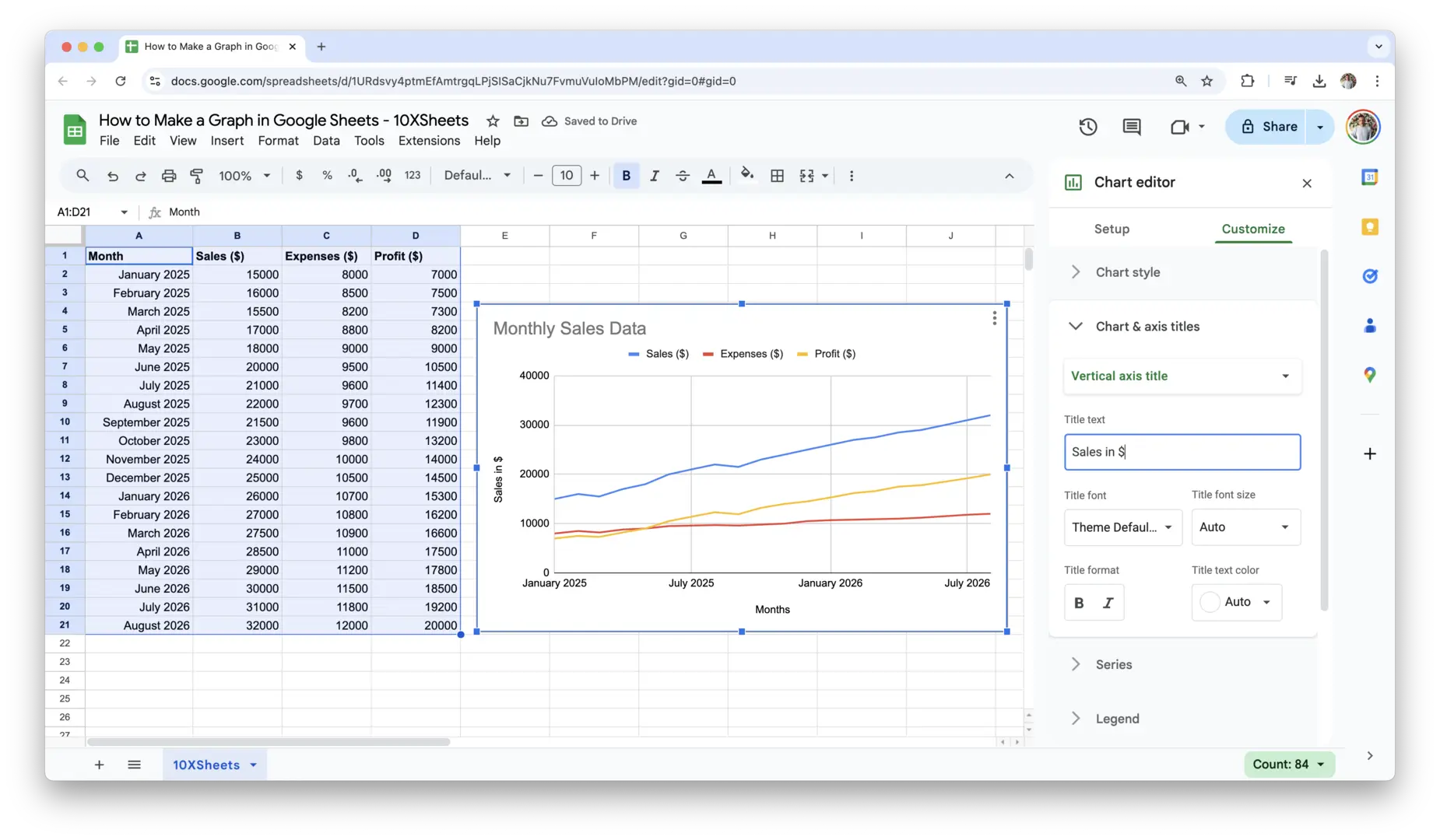
- Customize the Axis Titles: Labeling the axes is important for clarity, especially when presenting your data to an audience who may not be familiar with the specifics. To label your axes:
- In the Chart Editor, go to Customize and then to Chart & axis titles.
- Select either the Horizontal axis title or Vertical axis title, and add descriptive text (e.g., for a sales chart, you might use “Months” for the horizontal axis and “Sales in $” for the vertical axis).
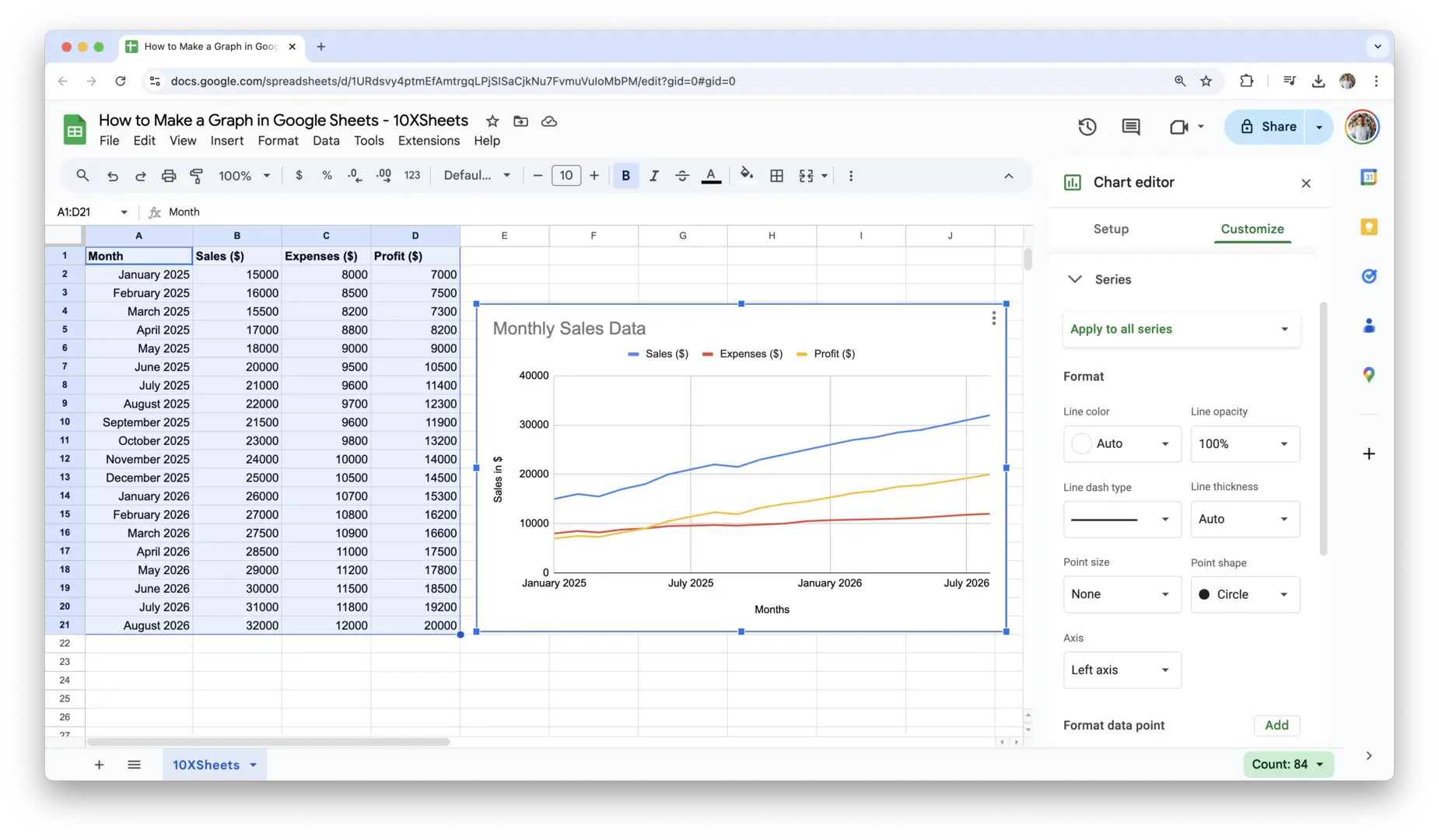
- Adjust Chart Colors: Colors help differentiate between data series and make your chart more visually appealing. To change the chart colors:
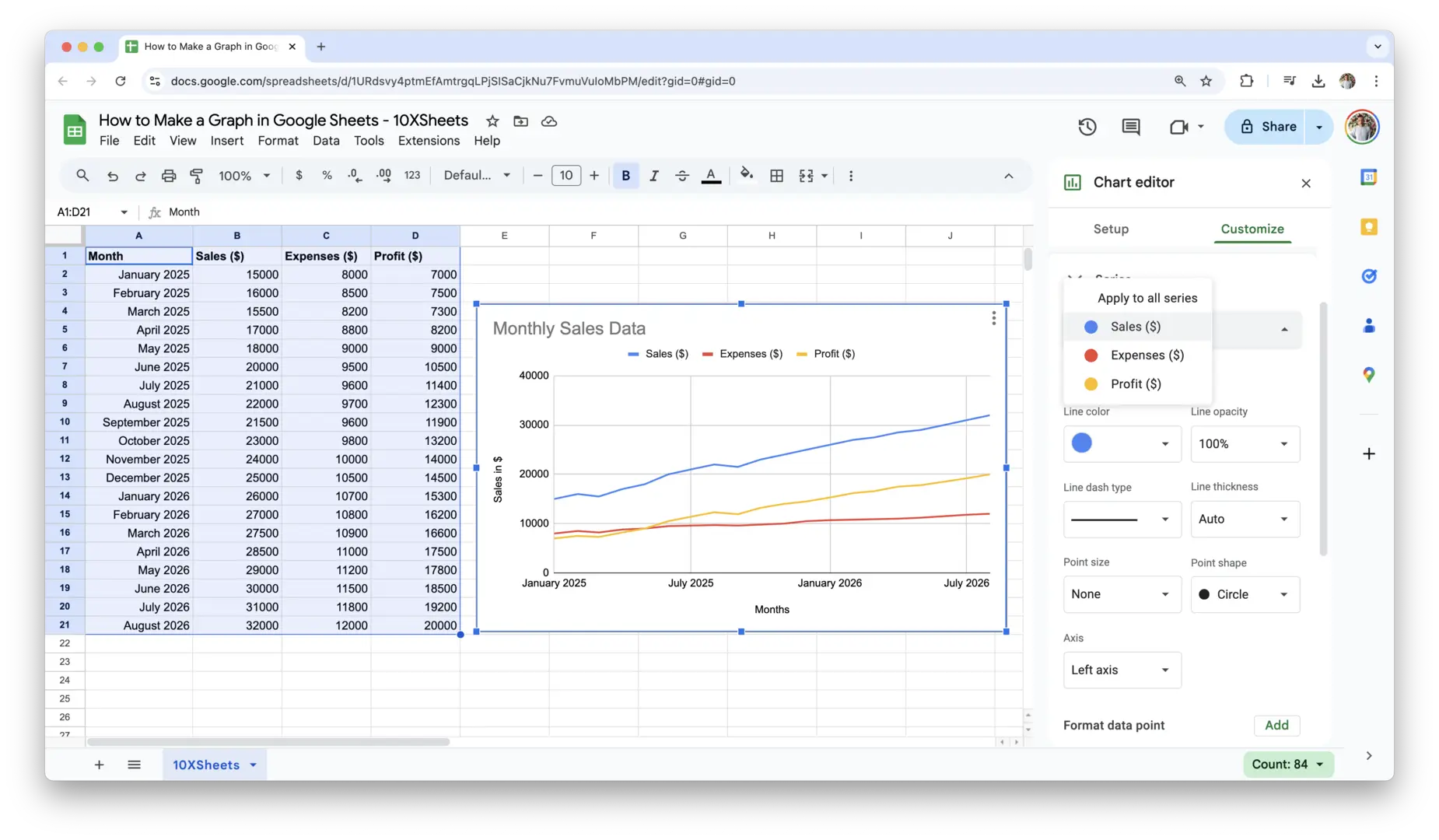
- In the Chart Editor, navigate to the Series section under Customize.
- Click on the color next to each series and choose the color you prefer from the color palette. You can select different colors for different series to make each one easily distinguishable.
- In the Chart Editor, navigate to the Series section under Customize.
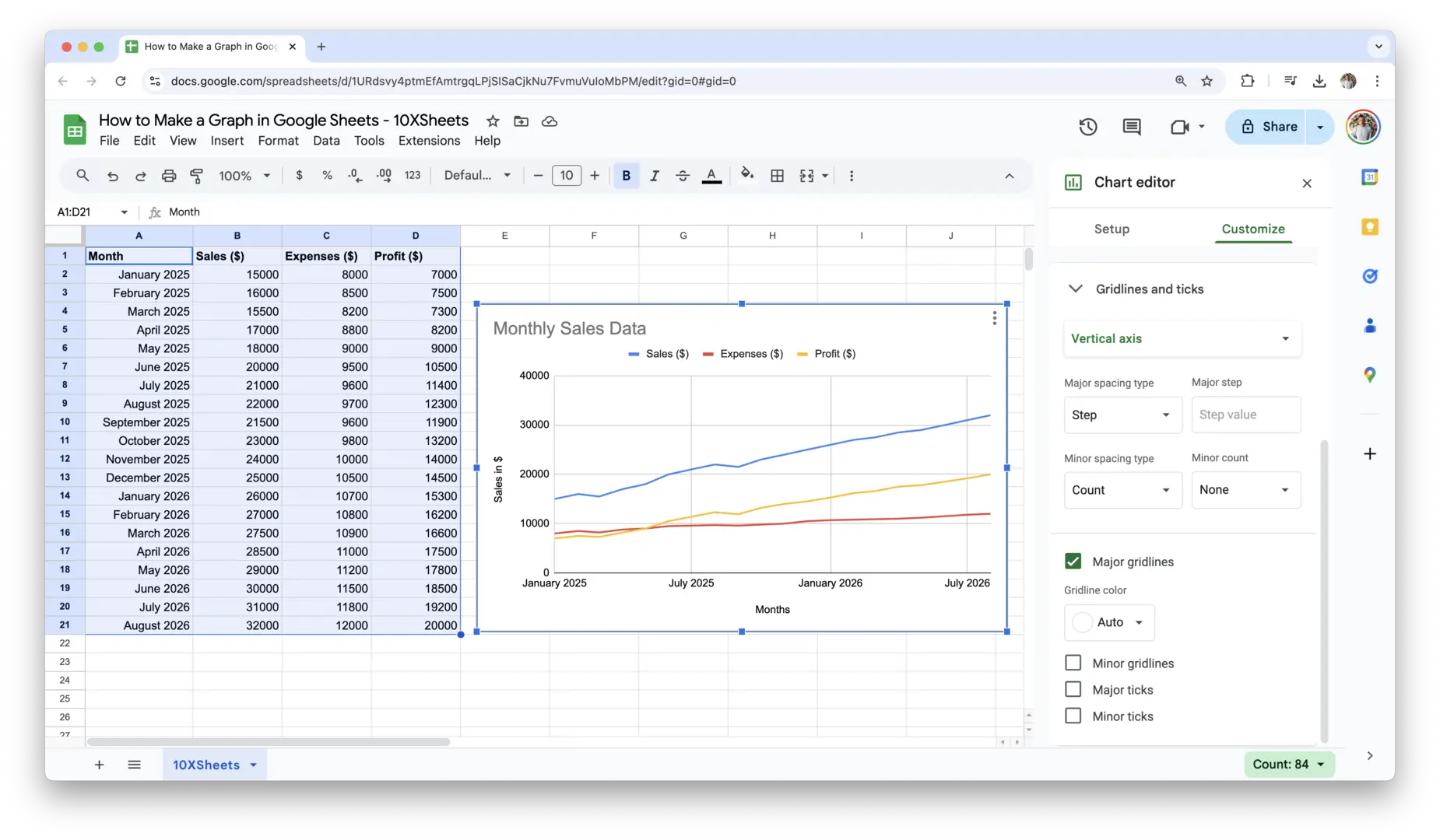
- Modify Gridlines and Ticks: Adding or adjusting gridlines can help make your chart more readable. In the Chart Editor under Customize, you can adjust the gridlines for the horizontal and vertical axes. You can make them thicker, change the color, or even remove them entirely for a cleaner look.
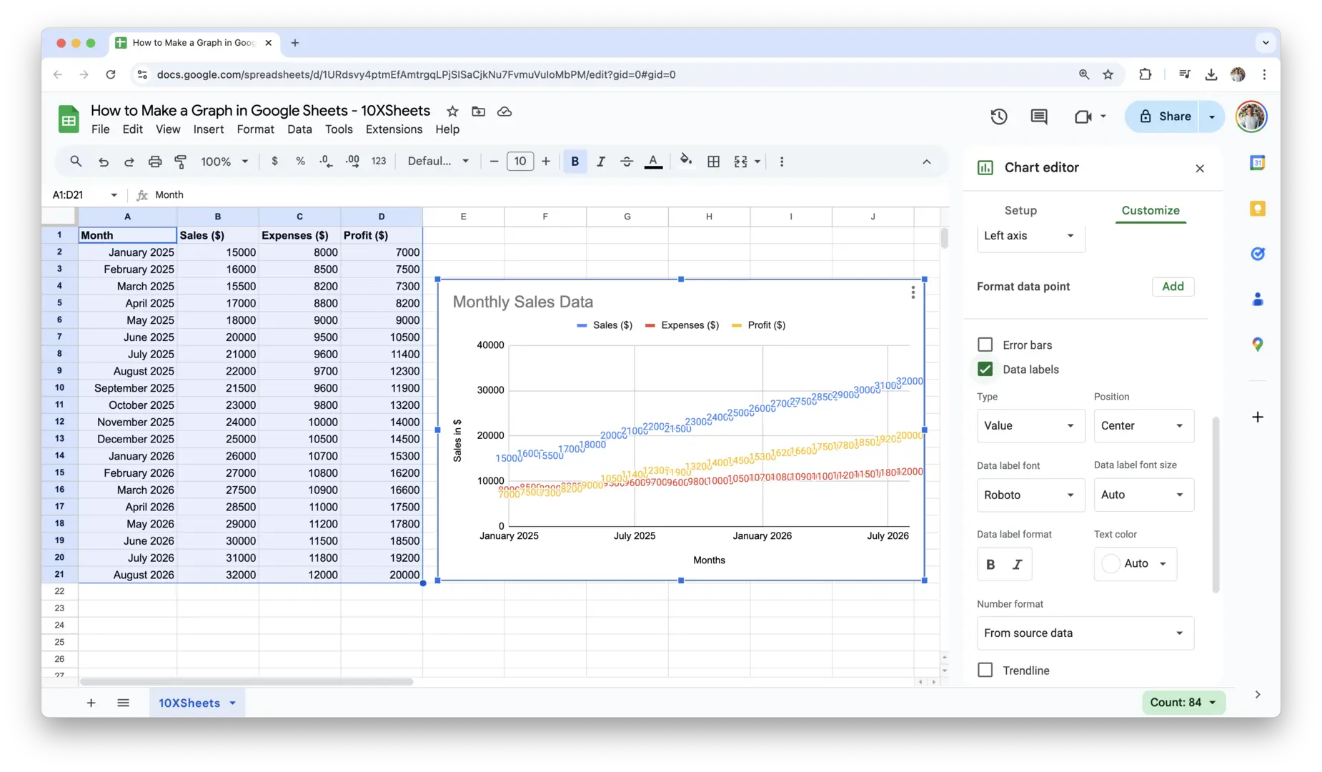
- Add Data Labels: If you want your audience to see the exact values for each data point, you can add data labels directly to the graph. To do this:
- In the Chart Editor, go to Series under Customize and check the box labeled Data labels. This will display the values of each point on the chart, making it easier for viewers to understand the exact numbers without needing to refer to the axes.
- In the Chart Editor, go to Series under Customize and check the box labeled Data labels. This will display the values of each point on the chart, making it easier for viewers to understand the exact numbers without needing to refer to the axes.
These customizations are just the beginning, but they will make your graph much clearer and more visually appealing. You can further refine your graph by experimenting with other customization options like font styles, chart borders, and other design elements.
Creating a graph in Google Sheets is not just about inserting data; it’s about making sure that data is presented in a way that’s easy to understand and visually engaging. With a few simple steps, you can take your basic graph and turn it into a polished, professional-looking visualization that communicates your data effectively.
How to Customize Your Google Sheets Graph?
Customizing your graph is an essential step in making it more informative, visually appealing, and easy to understand. Once you’ve created your graph, you can fine-tune its appearance to better align with your data and the message you want to convey. Whether it’s adjusting the color scheme, changing the layout, or adding additional elements like legends and data labels, these customizations will help your graph stand out and effectively communicate your data.
Adjusting Chart Style and Colors
Colors and styles play a significant role in making your graph visually engaging and easy to interpret. Google Sheets allows you to customize your chart’s appearance to ensure it aligns with your preferences or the aesthetic of your presentation. You can easily adjust the colors of different elements within your chart, from the data series to the background, making the graph both clearer and more attractive.
To change the color of your chart elements:
- Click on the graph to open the Chart Editor.
- Go to the Customize tab and navigate to the Series section.
- You’ll see options to change the color of each individual data series. Simply click on the color box next to each series and choose a new color from the color palette or enter a hex color code for a custom shade.
Using contrasting colors for different data series makes your chart more readable, especially if you have multiple categories. Be mindful of color blindness when choosing colors—select hues that are distinguishable for a wider range of viewers.
You can also adjust the chart’s overall style, such as changing the font or adding a background color. To adjust the style further, you can modify the chart’s border, shadow, or 3D effect (if applicable), giving your graph a more dynamic or polished look.
Changing Graph Types and Layout Options
Sometimes, the initial graph you create may not fully represent your data as effectively as you’d hoped. Google Sheets makes it easy to change the graph type or switch up the layout. This is especially useful if you start with one graph type and realize that another one would display the data more clearly.
To change the graph type:
- Click on the graph to open the Chart Editor.
- Under the Setup tab, find the dropdown menu next to Chart type.
- You can select from a wide variety of graph types, such as bar charts, line charts, pie charts, scatter plots, and more. Simply choose the new chart type, and Google Sheets will automatically adjust the graph to reflect your selection.
Changing the layout involves adjusting the arrangement of your graph’s components, such as swapping the axes in a bar chart or changing the direction of your bars in a column chart. This can be done by selecting the Switch rows/columns option in the Setup tab, which will reorient how your data is presented.
Switching to a different layout or graph type can help emphasize particular data points or trends, making the information clearer to your audience.
Formatting the Chart for Clarity and Visual Appeal
A well-formatted chart isn’t just about looking good—it’s about making your data more understandable. Formatting your graph for clarity is essential to ensuring that it communicates your message effectively. You can adjust several elements of your graph to improve its legibility and visual appeal.
Start by reviewing your axis labels. Ensure they are easy to read and accurately describe what each axis represents. To format your axis labels:
- Go to the Chart Editor and open the Customize tab.
- Under the Axis section, you can adjust the font size, font style, and position of the labels.
- If the axis labels are long or overlap, try rotating them or adjusting the font size to make the graph cleaner.
Next, consider the graph’s title and subtitle. They should clearly explain the purpose of the chart. Adjust the title’s font size and style to ensure it’s prominent but not overwhelming. Also, add a subtitle if necessary to give more context.
Don’t forget about spacing. Ensure that the data points aren’t too crowded or too sparse, which can make the chart harder to read. You can adjust the spacing between data points, particularly in scatter plots, line charts, or bar charts, to avoid cluttering the graph.
Adding Legends, Gridlines, and Data Labels for More Detail
Adding extra elements like legends, gridlines, and data labels helps provide more context and clarity to your graph. These additions make it easier for your audience to understand the data at a glance, particularly when comparing multiple data series or looking for specific values.
- Legends: A legend is essential when your chart contains multiple data series. It helps distinguish between different data sets by labeling each series with a color or symbol. To add a legend:
- Go to the Customize tab in the Chart Editor.
- Under Legend, you can position the legend (top, bottom, left, or right) and adjust the font size and style.
Adding a well-positioned legend will prevent the graph from becoming overcrowded while still making it clear which data series each color represents.
- Gridlines: Gridlines provide reference points across the chart, making it easier for your audience to read the values at a glance. You can adjust the gridlines for both the horizontal and vertical axes by going to the Customize tab and selecting Gridlines. Consider adjusting the thickness and color of gridlines for better visibility or removing them entirely for a cleaner look.
- Data Labels: Data labels display the actual values for each data point directly on the graph. This is particularly helpful when you need to show exact numbers, such as sales figures or test scores. To add data labels:
- In the Chart Editor, go to the Series section under Customize.
- Check the box next to Data labels.
Data labels can be placed on the data points themselves, making it easy for your audience to see the exact values without needing to refer to the axis. Customize the position of these labels to ensure they don’t overlap with other elements in the graph.
By adding these elements, you’re making your graph more informative and easier for your audience to interpret. Whether you’re presenting data in a meeting or sharing a report, these customizations help ensure that your graph stands out and effectively communicates the information you want to share.
Advanced Google Sheets Graph Customization
Once you’ve mastered the basics of graph creation and customization in Google Sheets, you can take your charts to the next level with more advanced features. These customizations allow you to enhance your graph’s functionality and presentation, making your data even more insightful and visually compelling.
Using Trendlines and Data Series
Trendlines are powerful tools for highlighting overall trends in your data. They help show the direction or pattern that the data is following, whether it’s an upward or downward trend. Adding a trendline to a graph is especially useful in line charts or scatter plots, where you want to visualize long-term trends amidst fluctuating data points.
To add a trendline:
- Click on the graph to open the Chart Editor.
- Go to the Customize tab and select Series.
- Under the Series section, you’ll find an option to add a trendline. You can choose from different types of trendlines, such as linear, exponential, or polynomial, depending on the nature of your data.
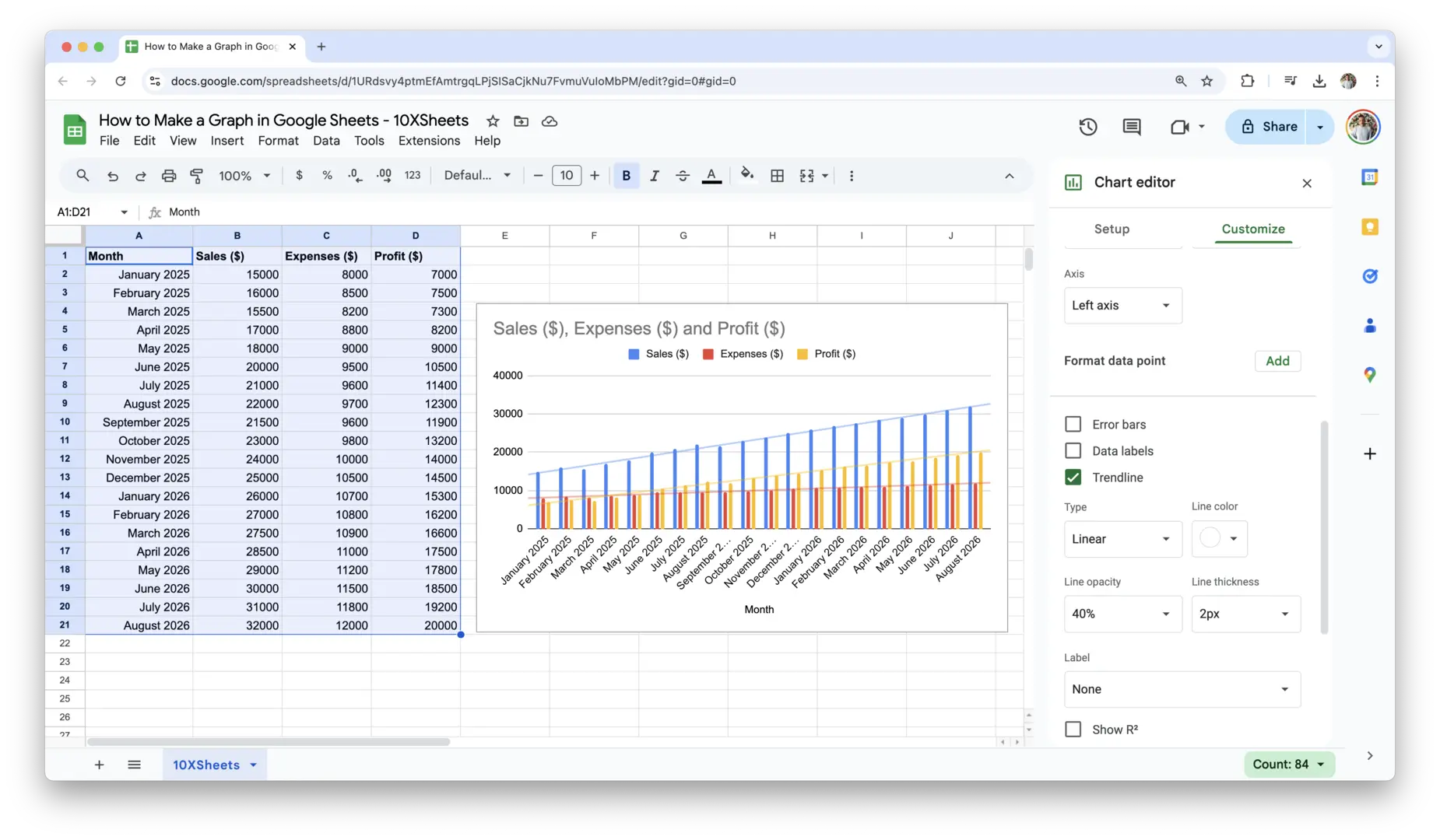
For instance, if you’re tracking sales over several months and want to predict future sales trends, a linear trendline would work well to indicate steady growth or decline. For more complex data patterns, you can experiment with polynomial trendlines, which allow for curving lines that fit more intricate fluctuations.
You can also adjust the trendline’s color, thickness, and opacity to make it stand out or blend in, depending on how prominent you want it to be in relation to the data points.
Adding Custom Axis Titles and Modifying Axis Scales
Customizing your axis titles and adjusting the axis scales are crucial steps in improving the clarity and precision of your graph. Axis titles help your audience understand what each axis represents, and modifying axis scales ensures that the graph accurately reflects the range and distribution of your data.
To add custom axis titles:
- In the Chart Editor, go to the Customize tab.
- Under Chart & axis titles, select Horizontal axis title or Vertical axis title.
- Enter a clear, descriptive title for each axis. For example, if you’re plotting sales data over months, you might title the horizontal axis “Months” and the vertical axis “Sales ($)”.
Adjusting the scale of your axes is important if your data includes very large or very small numbers. To modify the scale:
- In the Customize tab, go to Vertical axis or Horizontal axis.
- You can set a specific minimum or maximum value for the axis or adjust the step size (the increment at which data points appear along the axis). For example, if your vertical axis represents sales, and your sales data ranges from 1,000 to 10,000, setting the minimum value to 1,000 and the maximum to 10,000 will ensure the graph displays all the data without unnecessary space.
By customizing your axes, you ensure that your graph is easy to read and that the data is presented accurately, especially when working with large datasets.
Merging Data for Multi-Axis Charts
Multi-axis charts are particularly useful when you have two sets of data that need to be compared but use different scales. For example, if you’re comparing revenue and the number of customers over time, one set of data (revenue) might be measured in dollars, while the other (customer count) is measured in individual people. By using multiple axes, you can place each dataset on its own axis, making the graph more readable.
To create a multi-axis chart:
- First, insert a chart with your data.
- In the Chart Editor, go to the Customize tab and select Series.
- Select the series you want to move to the second axis and under Axis, choose Right axis (or left axis if you prefer).
- Once your data series are assigned to their respective axes, you can adjust the scales for each axis separately, ensuring that the data fits within the correct range.
Multi-axis charts are a great way to compare different types of data with different units of measurement while maintaining clarity and avoiding distortion of the data.
How to Share and Embed Google Sheets Graphs?
Once your graph is ready, you’ll likely want to share it with others or embed it in another document. Google Sheets offers several options for sharing your work, whether you need to collaborate in real-time or embed your graph into presentations and reports. Here’s how to do it.
How to Share a Google Sheets Document with Others?
Sharing your Google Sheets document is easy and efficient, and it’s perfect for collaborative work. Whether you’re working on a team or simply want to get feedback, Google Sheets allows you to control who can view or edit the document.
To share a Google Sheet:
- Open your Google Sheets document and click the Share button in the top-right corner.
- Enter the email addresses of the people you want to share the document with. You can choose whether they can view, comment on, or edit the document by adjusting the permissions.
- Alternatively, click on Get shareable link to copy a link that you can send to others. You can control whether the link allows anyone with it to view, comment, or edit the document.
- If you want to ensure privacy, you can restrict the link to specific people, preventing anyone without permission from accessing the sheet.
Sharing your document this way allows others to view your graph directly in Google Sheets, ensuring they see the most up-to-date version.
Embedding Graphs into Other Google Products (Docs, Slides)
Google Sheets allows you to seamlessly embed your graphs into other Google products, such as Google Docs and Google Slides, making it easy to incorporate your charts into reports, presentations, or documents.
To embed a graph into Google Docs or Slides:
- In your Google Sheets document, click on the chart you want to embed.
- Click the Copy Chart button that appears above the graph.
- Open your Google Docs or Slides document and paste the chart where you want it to appear. You can do this by pressing Ctrl + V (Windows) or Cmd + V (Mac).
- After pasting, you’ll be given the option to link the chart to the original spreadsheet, which ensures that any updates to the graph in Sheets are automatically reflected in your document. You can also choose to embed the chart as a static image if you don’t want it to update.
This feature is particularly helpful when creating presentations or reports that require frequent updates to data or when collaborating with others.
Exporting Graphs as Images or PDFs
If you need to use your graph outside of Google Sheets, exporting it as an image or PDF is a convenient way to preserve its quality and share it with others. This is especially useful when you need to include the graph in printed reports, external presentations, or emails.
To export your graph:
- Click on the chart in your Google Sheets document.
- In the top-right corner of the chart, click the three vertical dots (more options) and select Download.
- You’ll be given the option to download the graph as either a PNG (image) or PDF file. Choose the appropriate format based on how you plan to use or distribute the graph.
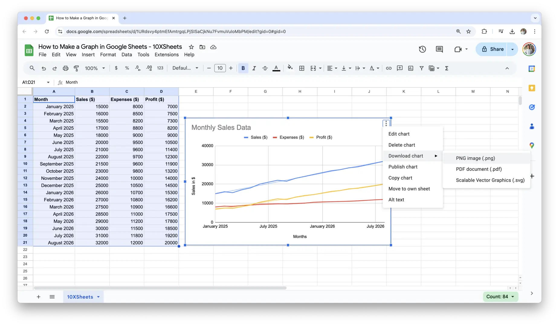
Once exported, you can insert the graph into documents, emails, or other applications that don’t support live Google Sheets data, while maintaining the visual integrity of the chart.
These options allow you to share your work in a way that fits your needs, whether you’re collaborating with colleagues, embedding a graph in a report, or exporting it for offline use.
Troubleshooting Common Google Sheets Chart Issues
Sometimes, issues can arise when creating graphs in Google Sheets. Fortunately, most problems can be fixed quickly with a few adjustments. Here are some common issues and how to resolve them:
- Mismatched Data Ranges: If your chart isn’t showing the correct data or is displaying unexpected results, double-check your data range. Ensure that the range selected includes both the labels and values you want to graph.
- Incorrect Chart Type: If your chart doesn’t seem to fit your data, it could be because you’ve chosen the wrong graph type. Try switching to a different chart type that better suits the nature of your data (e.g., using a line chart for time-based data or a pie chart for proportions).
- Data Overlapping or Misaligned: If your labels or data points are overlapping, try adjusting the size of the chart or the font size for better spacing. You can also rotate axis labels to make them fit better.
- Missing or Incorrect Axes: If your graph is missing labels or has incorrect axes, make sure that you’ve set custom axis titles under the chart’s Customize tab. Also, check that the correct data is assigned to each axis.
- Empty Cells in the Data Range: Empty cells within your selected range can cause gaps in the graph or lead to incomplete data being displayed. Ensure all data cells are filled or remove rows/columns with missing values.
- Scaling Issues: If your graph seems stretched or compressed, it may be due to improper scaling. Adjust the axis range to fit the data better by setting custom minimum and maximum values for the axis.
- Data Points Not Displaying Properly: If you have small or large data points that are hard to see, consider adjusting the scale of your axes or changing the size of your data markers (for scatter plots or line charts).
- Graph Not Updating with New Data: If your graph doesn’t reflect the most recent data changes, make sure the data range is dynamic and includes the new entries. You may need to adjust the data range manually or set up a dynamic range if your data grows over time.
- Errors in Calculations: Double-check any formulas or data transformations in your dataset, as incorrect calculations can distort the graph. Make sure all formulas are correctly input and functioning as expected.
These troubleshooting tips should help you resolve most common graphing issues quickly and get your charts looking exactly as you need them to.
Conclusion
Creating graphs in Google Sheets is a straightforward way to present your data in a more digestible and engaging format. With just a few clicks, you can turn complex data into clear visuals that make it easier to understand key trends, comparisons, and insights. By customizing your graphs, adjusting colors, labels, and titles, you can enhance their effectiveness and make them even more informative. Whether you’re sharing your work with colleagues or including charts in a report, Google Sheets offers all the tools you need to create professional-looking graphs.
The more you practice, the more you’ll feel confident in using Google Sheets’ graphing tools. From basic charts to more advanced options like trendlines and multi-axis graphs, there’s a lot you can do to take your data visualization to the next level. And if you run into any issues, don’t worry—troubleshooting is part of the process, and it’s easy to fix common problems once you know what to look for. So, next time you need to present data, try creating a graph in Google Sheets and let the numbers speak for themselves.
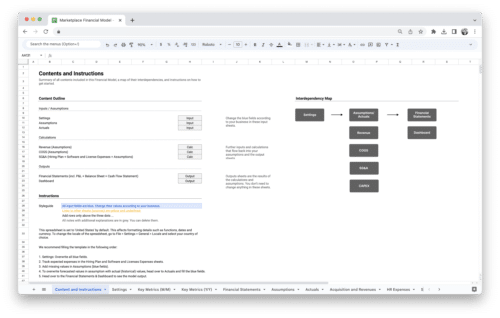
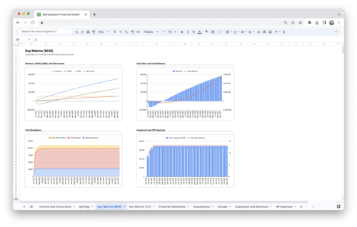
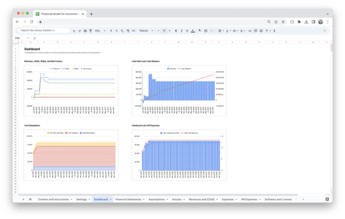
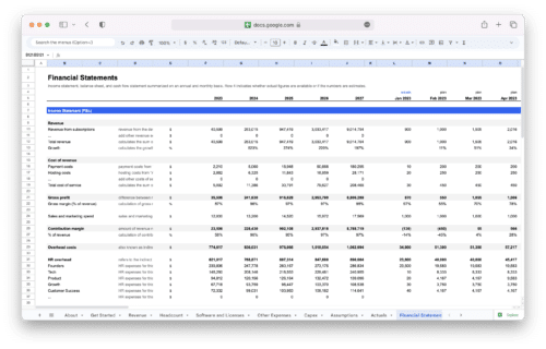
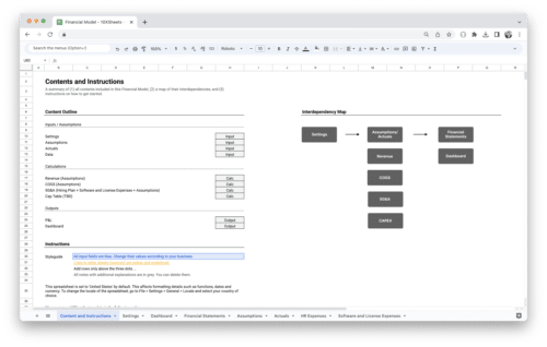
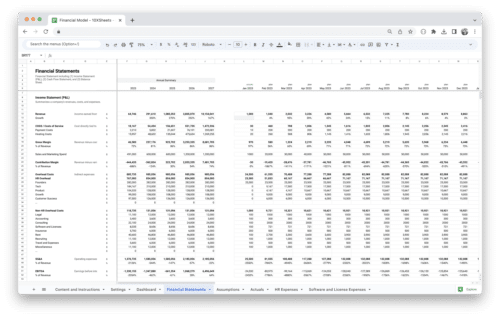
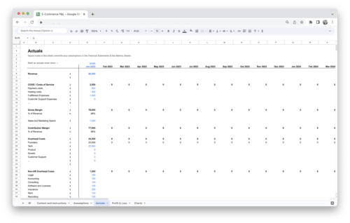
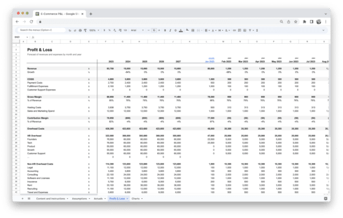
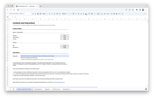
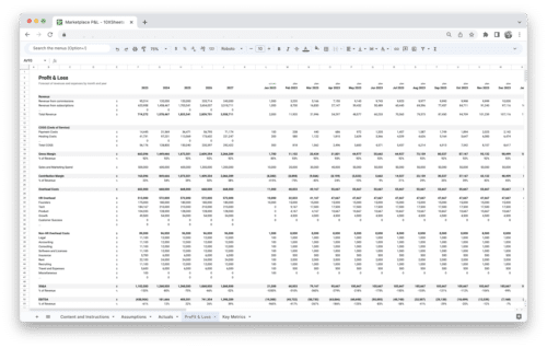
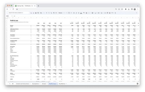
Get Started With a Prebuilt Template!
Looking to streamline your business financial modeling process with a prebuilt customizable template? Say goodbye to the hassle of building a financial model from scratch and get started right away with one of our premium templates.
- Save time with no need to create a financial model from scratch.
- Reduce errors with prebuilt formulas and calculations.
- Customize to your needs by adding/deleting sections and adjusting formulas.
- Automatically calculate key metrics for valuable insights.
- Make informed decisions about your strategy and goals with a clear picture of your business performance and financial health.