
Description
Tracking user engagement can be overwhelming, especially when your data is scattered across multiple platforms and hard to interpret. Without a clear, unified view of how users are interacting with your product, it’s challenging to make informed decisions that drive growth, improve retention, and optimize your user experience. You need a solution that pulls all your essential engagement data into one place, offering actionable insights that help you focus on what matters most.
Our User Engagement Dashboard Template solves this problem by providing a sleek, easy-to-use platform where you can visualize key engagement metrics in real time. This template is designed to streamline your data, helping you track everything from active users and retention rates to feature usage and conversion metrics. With customizable options, you can tailor the dashboard to your unique needs and make smarter, more informed decisions to improve user satisfaction, boost engagement, and drive business growth. Take the guesswork out of user behavior and start using insights that help you grow your business effectively.
User engagement is a critical concept for businesses that want to succeed in the digital landscape. It refers to the degree to which users interact with a product, service, or platform, reflecting how invested and involved they are with what a business offers. Engagement isn’t just about users using a product—it’s about how they experience and relate to it over time. A high level of user engagement often means that users are not only interacting frequently but are doing so in meaningful ways that drive value for both them and the business.
What is User Engagement?
At its core, user engagement describes the emotional and behavioral investment users have in a product. It’s a comprehensive measure that looks at both quantity and quality of interactions. For example, the number of times a user logs in, how long they stay on the platform, how many features they engage with, and the value they derive from the product or service all contribute to engagement levels.
User engagement goes beyond mere visits or clicks; it’s about ensuring users are actively involved, deriving benefit from what you offer, and returning repeatedly over time. This concept applies to websites, mobile apps, social media platforms, e-commerce sites, SaaS products, and more. For businesses, engagement directly correlates to the health and success of the product or service. If users engage with your platform, they’re more likely to stay longer, spend more, and become loyal customers.
Why does user engagement matter? Simply put, high engagement levels are typically a sign that a product is meeting users’ needs, providing value, and fostering a strong, positive relationship with the user base. A strong level of engagement can be a key driver of user retention, brand loyalty, and ultimately business growth.
Importance of User Engagement in Today’s Digital Landscape
In today’s highly competitive and digital-first world, user engagement has become more critical than ever. As more businesses move online and more platforms flood the market, capturing and retaining users is becoming increasingly challenging. The benefits of high user engagement go beyond just user retention—engagement directly impacts a business’s ability to stay relevant and competitive in the market.
- Increased competition: With more businesses and platforms vying for users’ attention, fostering high engagement is a critical way to differentiate yourself and maintain relevance in your industry.
- Higher retention rates: Engaged users are more likely to stick around, reducing churn and increasing lifetime value (LTV). This is particularly important when user acquisition costs are on the rise.
- Stronger brand loyalty: Engagement fosters a deeper connection with users, which can turn casual customers into long-term advocates for your brand.
- More data for improvements: When users engage frequently with a product, they provide valuable feedback and data that can be used to improve the product, making it even more appealing to future users.
- Improved conversion rates: Highly engaged users are more likely to convert into paying customers, especially in the context of freemium models or subscription-based services.
- Enhanced word-of-mouth marketing: Engaged users are more likely to recommend your product to others, helping you grow your user base without significant additional marketing spend.
Engagement is the foundation of success in the digital world because it reflects how well you’ve captured the attention and loyalty of your users. Without engagement, you risk becoming irrelevant, failing to convert users into paying customers, or losing them entirely to competitors.
How a User Engagement Dashboard Template Can Help Businesses Track and Optimize User Interactions
A user engagement dashboard is a powerful tool for businesses looking to track, measure, and optimize how users interact with their platform. It centralizes all relevant data into a single view, making it easier for teams to monitor performance, identify patterns, and take actionable steps to improve user experience. A dashboard can turn raw user data into meaningful insights that drive smarter decision-making, ultimately helping businesses foster better engagement.
- Centralized data visualization: A user engagement dashboard aggregates data from multiple sources, allowing businesses to see an overview of user behavior in real time. This consolidated view allows teams to quickly identify trends, whether positive or negative, and act accordingly.
- Real-time tracking of user behavior: Dashboards provide real-time data, allowing businesses to track how users are interacting with the product at any given moment. This means businesses can monitor engagement as it happens, giving them the ability to adjust their strategies on the fly.
- Targeted insights for optimization: By analyzing engagement patterns, dashboards can highlight which features or aspects of the platform are underperforming or where users tend to drop off. This information can be used to optimize these areas for better retention and engagement.
- Segmentation capabilities: Dashboards can segment users by behaviors, demographics, or other criteria, helping businesses tailor their strategies to specific user groups, improving the overall user experience.
- Improved decision-making with KPIs: By focusing on key performance indicators (KPIs) like DAU, MAU, and retention rates, dashboards make it easy to measure the effectiveness of marketing campaigns, product updates, or feature launches.
- Actionable reporting: Dashboards allow for detailed reporting on user engagement, providing businesses with clear data on how their efforts are translating into user activity. This means teams can quickly pivot and refine their strategies to keep engagement high.
With a user engagement dashboard template, businesses are empowered to make data-driven decisions that can lead to increased user satisfaction, improved retention, and ultimately, greater business success. It serves as a real-time guide, pointing businesses in the right direction to enhance user engagement and optimize the user experience.
Key Metrics to Measure User Engagement
To truly understand and optimize user engagement, businesses must track a variety of key metrics. These metrics provide a clear snapshot of how users interact with the platform, which areas need improvement, and which strategies are most effective. By focusing on the right set of metrics, businesses can continuously improve user engagement and ensure that users are getting the most value from the platform.
- Active users: Measuring daily active users (DAU) and monthly active users (MAU) helps businesses understand how many users are interacting with their platform within a given period. This metric can also be used to track growth over time and assess the success of marketing campaigns or product launches.
- Retention rate: Retention rates show how many users continue using the product over time, highlighting how well the platform retains its audience. Tracking retention by cohort (e.g., by signup month or feature usage) helps businesses identify trends and improve user loyalty.
- Churn rate: The churn rate shows the percentage of users who stop using the product over a given period. A high churn rate can be an indicator that something is wrong with the product or user experience and that improvements are needed.
- Engagement depth: This includes metrics like how often users interact with specific features, the time spent on the platform, or the number of actions users take during each session. High engagement depth typically correlates with increased satisfaction and a deeper connection with the product.
- Conversion rate: Measuring how many users take a desired action, such as subscribing, making a purchase, or completing a goal, is crucial for understanding how well engagement translates into tangible business outcomes.
- Session length and frequency: Monitoring how long users stay on the platform and how often they return helps businesses gauge whether the product is providing enough value to keep users engaged over time.
Focusing on these metrics allows businesses to continuously refine and optimize their strategies, ensuring they’re meeting user needs and driving strong engagement levels. The right metrics provide insights into how users are interacting with the platform and where improvements can be made.
How Engagement Impacts Business Growth and User Retention
User engagement plays a pivotal role in driving both business growth and user retention. When users are engaged, they are more likely to return to the platform, use it regularly, and even advocate for it, which directly impacts a business’s bottom line. Engagement is a critical factor in fostering long-term success, as it helps to create a loyal user base that will support the platform through repeat usage, referrals, and positive reviews.
High engagement boosts user retention, reducing churn and increasing lifetime value (LTV). Users who engage frequently with the platform are more likely to see value, and as a result, they’re less likely to abandon it. Retaining users is far more cost-effective than constantly acquiring new ones, making user engagement a central focus for sustainable growth.
Engaged users also contribute to organic growth. When users find value in the platform and are invested in it, they are more likely to share it with others, whether through social media, word of mouth, or by recommending it to friends and colleagues. This kind of organic marketing is invaluable, as it can drive new users without significant investment in paid advertising.
Engagement also helps businesses gain valuable feedback and insights, enabling them to improve the product or service in ways that users truly want. The more engaged users are, the more likely they are to provide actionable feedback, which can be used to refine the user experience and introduce new features that resonate with the audience.
Ultimately, the higher the engagement, the greater the potential for business expansion. Engaged users contribute to greater retention, higher conversion rates, better word-of-mouth, and sustained growth, all of which are fundamental to a business’s long-term success.
User engagement dashboard templates are invaluable tools for tracking, analyzing, and improving how users interact with your product or service. They provide businesses with a centralized hub for real-time insights, making it easier to monitor progress, uncover patterns, and make data-driven decisions. Here’s why incorporating a user engagement dashboard template into your workflow can have a lasting impact:
- Streamlined data management: A dashboard aggregates data from multiple sources, offering a single, easy-to-understand view of user behavior across various platforms, which saves time and reduces the complexity of data analysis.
- Improved decision-making: With real-time insights at your fingertips, a user engagement dashboard helps you make quicker and more informed decisions, from adjusting marketing strategies to refining user experience.
- Enhanced performance tracking: By visualizing key metrics like DAU/MAU, churn rate, and conversion rates, a dashboard allows you to track how well your product is engaging users, helping you identify areas for improvement and monitor growth.
- Increased team collaboration: Centralized data helps teams—from product developers to marketers—collaborate better by sharing the same metrics and working toward common goals, ensuring alignment across departments.
- Better user segmentation: Dashboards allow you to track engagement by different user groups (e.g., demographics, geographic regions, or behaviors), helping you target your marketing efforts and optimize your product for specific user segments.
- Efficiency and time savings: Instead of manually generating reports or checking multiple platforms for data, a dashboard pulls everything together, providing a quicker way to analyze and act on user behavior without wasting valuable time.
- Predictive insights: Many dashboards come equipped with forecasting tools that can analyze trends in user behavior and predict future patterns, helping you plan ahead and stay agile in a rapidly evolving market.
- Actionable insights for growth: By presenting data in an easy-to-digest format, dashboards help identify opportunities for improvement, so you can take proactive steps to drive user engagement, retention, and overall business growth.
When choosing or designing a user engagement dashboard template, it’s important to focus on a few key features that will make your dashboard more efficient, insightful, and adaptable to your specific needs. A well-built dashboard isn’t just about displaying data; it’s about transforming that data into meaningful insights that drive smarter decisions. Below, we dive deep into the essential features you should look for in a user engagement dashboard template to ensure you’re getting the most out of your investment.
Customizability Options
One of the standout features of a top-tier user engagement dashboard template is its customizability. Every business has different needs, goals, and metrics to track, so a one-size-fits-all approach doesn’t work well when it comes to dashboards. Customizability allows you to tweak the dashboard to fit the unique aspects of your business.
At its core, customization means being able to adjust the layout to suit your preferences or those of your team. Whether you prefer a high-level overview or a deep dive into granular details, your dashboard should allow you to rearrange widgets, charts, and graphs so you can prioritize the data most relevant to you. For example, if you’re a marketing manager, you might want to prioritize metrics like conversion rates and social media engagement. If you’re in product development, you may focus more on feature usage and user feedback.
Moreover, customization allows you to select the exact metrics that you want to track. Engagement isn’t a one-size-fits-all concept, and not every metric is valuable to every business. You might want to track user retention over time, while another company might prioritize the number of active users per day or the frequency of specific in-app actions. The dashboard should let you customize what you see, ensuring you’re focusing on the metrics that matter most.
Lastly, dashboards should allow you to tailor visual elements—from color schemes to chart types—so they align with your brand or personal preferences. Being able to adjust how data is displayed can help make the dashboard not only easier to read but also more aesthetically appealing, improving the experience for everyone involved.
Integration with Analytics Tools
Another must-have feature in any user engagement dashboard is the ability to integrate with external analytics tools. No business operates in a vacuum, and you likely use several platforms to track your user interactions across different touchpoints. A good dashboard template should allow you to connect seamlessly to various analytics tools, pulling data directly from your CRM, Google Analytics, or social media platforms.
For example, integrating Google Analytics allows you to monitor website traffic alongside other engagement metrics. You can combine real-time page views, bounce rates, session durations, and more with other in-app engagement metrics. This gives you a complete picture of your user’s journey, from the first visit to becoming a repeat customer.
Social media integrations, such as with Facebook Insights, Instagram Analytics, or Twitter Analytics, are crucial if you’re actively engaging users across these platforms. These integrations provide a clear view of how your social campaigns or posts are impacting user behavior. You can track likes, shares, comments, and engagement rates, and then connect that data with website or app metrics to understand how social media interactions drive overall user engagement.
Beyond just these common integrations, many dashboards can also link with specialized platforms such as Mixpanel or Hotjar, which are excellent for tracking user behavior inside apps or on websites. Mixpanel, for example, can help track how users engage with specific features, how they flow through various parts of your app, and where they drop off. When combined with other metrics, this can provide granular insights that allow you to optimize both the user experience and your business strategy.
Being able to integrate your dashboard with multiple tools means all your data comes together in one central location. This eliminates the need to manually pull reports from different platforms, saving you time and reducing the risk of errors. It allows you to work smarter and ensure you’re making decisions based on a complete and accurate data set.
Visual Representation of User Behavior and Trends
A powerful feature of any user engagement dashboard template is its ability to present data in a visually intuitive and engaging way. Numbers alone can be overwhelming, especially when there’s a lot of data to sift through. The right visual representation makes it easier to spot trends, identify patterns, and interpret user behavior, helping you draw actionable insights quickly.
Graphs, charts, and heatmaps are some of the most effective ways to represent engagement data. Line charts can be used to track the growth of active users over time, helping you visualize whether your user base is growing or stagnating. Bar charts can help compare engagement across different demographics, like age groups or geographic locations. Heatmaps are particularly useful for understanding user behavior in apps or on websites. They show where users are clicking, scrolling, or interacting most frequently, which can give you valuable insights into the areas of your platform that users find most interesting or problematic.
Having visual timelines and flowcharts in your dashboard can also add another layer of insight. For example, you can use timelines to track when user engagement peaks, correlating it with marketing campaigns, product launches, or seasonal trends. Flowcharts can visualize how users navigate your platform—showing where they come in, what features they engage with, and where they exit. This can help you identify friction points, bottlenecks, or features that users aren’t interacting with as much as expected.
Another great way to visualize user engagement is through funnel charts. These charts are particularly useful when analyzing how well your user journey is converting at each stage. You can track everything from new sign-ups, active users, feature usage, to paying customers, helping you pinpoint where users are dropping off and where engagement is weakest.
The key to effective visual representation is not just having fancy charts, but ensuring they provide clarity and tell a story. The more clear and actionable your visualized data is, the easier it will be to make informed decisions. This leads to more effective product iterations, optimized user experiences, and overall business growth.
Real-time Tracking and Reporting
The world of user engagement moves fast, and so should your dashboard. Real-time tracking and reporting allow you to see what’s happening with your users at any given moment, giving you a competitive edge in responding to shifts in behavior or trends.
For example, real-time data lets you monitor how users are interacting with a newly launched feature or promotion. If a campaign suddenly drives a spike in engagement, you can immediately track those changes, assess the impact, and optimize the campaign accordingly. This level of immediacy makes it much easier to react and pivot when necessary, instead of waiting for end-of-week or monthly reports.
Real-time tracking also lets you stay ahead of potential issues. For instance, if a significant portion of users starts to drop off or show a decline in activity, you can spot this trend right away and investigate what may be causing it. Are users having trouble with a particular feature? Is there a bug that’s causing frustration? With real-time insights, you can immediately address these issues before they turn into bigger problems.
The ability to create automated, real-time reports is also essential for teams that need constant updates. Many dashboard templates allow you to set up automatic reports that are delivered to your inbox or team on a regular basis. These reports can be customized to highlight the most relevant metrics, ensuring your team members always have the latest data at their fingertips.
Beyond just tracking, real-time reporting can also help forecast trends based on immediate data. For example, if you’re running a marketing campaign, real-time reporting can show how user engagement is trending in comparison to previous campaigns, helping you forecast the long-term impact of your efforts.
Real-time tracking and reporting keep you agile. You can take swift action based on up-to-the-minute data, adjusting your strategy, optimizing user experience, and solving problems quickly, which ultimately leads to a better product and happier users.
Setting up a user engagement dashboard template involves several crucial steps that help you collect, organize, and interpret data in a way that’s both actionable and meaningful. The process isn’t just about plugging in a few numbers and watching the charts populate; it requires thoughtful planning, selecting the right tools, and ensuring your data is both accurate and reflective of your goals. With the right setup, your dashboard can be a powerhouse for decision-making and strategic planning.
1. Choose the Right Dashboard Software
The first step in setting up your user engagement dashboard is choosing the right software to host it. The platform you choose will depend on your business’s specific needs, budget, and team preferences. Two of the most accessible options for creating dashboards are Excel and Google Sheets, but there are several other tools available that offer more advanced features for complex tracking.
Excel and Google Sheets are great for smaller teams or businesses that need a simple, budget-friendly solution. Both platforms allow you to create custom charts, graphs, and tables, making them suitable for a variety of user engagement metrics. They also offer templates that can be easily customized to track specific KPIs, which is particularly helpful for those who are new to building dashboards. These platforms work well if you have a solid grasp of data analysis and are comfortable manipulating spreadsheets to match your goals.
However, if you need more robust features, you may want to explore specialized dashboard software like Tableau, Power BI, or Domo. These tools are designed for larger datasets and provide more advanced analytics and visualization options. Tableau, for example, is known for its ability to connect to a variety of data sources and create highly interactive and visually compelling dashboards. Power BI integrates seamlessly with other Microsoft tools and is perfect for businesses already within the Microsoft ecosystem. Both of these platforms also provide built-in forecasting and predictive analytics, which can be invaluable if you want to forecast trends based on user engagement data.
When choosing your software, consider factors like:
- Ease of use: How comfortable is your team with the tool? Will they need training or onboarding?
- Integration capabilities: Does the tool allow easy integration with other platforms you use?
- Budget: What are the costs associated with each tool? Does the tool offer the features you need within your budget?
Once you’ve selected your dashboard software, the next step is to set it up to ensure it collects and displays the data that matters most to your business.
2. Integrate Data Sources and Syncing Platforms
The next essential step in creating your user engagement dashboard is integrating the data sources you’ll use to populate it. The goal here is to gather all relevant user data from multiple platforms and bring it into your dashboard so you can track and analyze everything in one place. This integration is what transforms your dashboard from a static tool to a dynamic, real-time reporting system.
You likely already use a variety of analytics tools to track user behavior across different channels. For example, you might track website visits with Google Analytics, social media engagement with Facebook Insights or Twitter Analytics, and app activity with tools like Mixpanel or Firebase. The trick is to bring all this data into your dashboard without needing to manually pull reports from each source.
Most modern dashboard software provides native integrations with these popular analytics tools, which means you can easily sync the data. For example, you can directly pull data from Google Analytics to track page views, bounce rates, and other key engagement metrics. Similarly, platforms like Mixpanel or Amplitude allow you to pull data on how users interact with your product, providing insights into which features they use most or where they drop off in the user journey.
If you’re working with a more complex system, or if you’re dealing with proprietary tools, you may need to use API integrations or webhooks to connect your data sources to your dashboard. APIs allow for deeper customization and are especially useful if you need to pull specific data points that aren’t available via native integrations.
Once your integrations are set up, it’s crucial to sync platforms correctly. Syncing ensures that all of your data is up-to-date and that there are no discrepancies between your dashboard and the data sources. This is especially important if you’re tracking time-sensitive metrics like active users, page visits, or conversion rates. Keeping everything in sync minimizes errors and provides an accurate reflection of current user engagement.
3. Organize and Categorize Metrics Effectively
Now that your data sources are integrated, the next challenge is organizing and categorizing the metrics. It’s easy to feel overwhelmed by the volume of data available, especially when dealing with large amounts of user behavior information. The key is to prioritize and categorize the metrics that align with your business goals and provide actionable insights.
Start by identifying your key performance indicators (KPIs)—the metrics that are most important to your business. For example, you may want to track:
- Active users: Daily or monthly active users (DAU or MAU) show the overall reach and growth of your product.
- User retention: How many users are returning after their first visit or sign-up?
- Engagement depth: This could include tracking in-app actions like clicks, shares, or specific feature usage.
- Conversion rates: If you’re running a SaaS product, you may be interested in how many free users convert to paid plans.
Once you’ve identified your KPIs, group them logically. You might categorize them based on the stage of the user journey they relate to. For example, you could have:
- Acquisition metrics: Metrics like new sign-ups, website visits, or referral traffic.
- Engagement metrics: Metrics related to how users interact with your product, such as time spent on the platform, number of interactions, or feature usage.
- Retention metrics: Metrics like churn rate, reactivation rates, and user lifetime value (LTV).
You can also categorize metrics by user segment. For example, you might want to track how new users engage differently from long-term users, or compare the engagement of users from different geographic locations, demographics, or traffic channels.
The organization is not just about convenience; it’s about ensuring that the data tells a clear, actionable story. You want to be able to spot trends and opportunities quickly, so the dashboard layout should be clean and intuitive. Keep your most important metrics easily accessible at the top, and use charts and graphs to visualize changes over time or to highlight areas that require attention.
4. Ensure Data Accuracy and Consistency
The accuracy and consistency of the data displayed in your dashboard are paramount. A dashboard with inaccurate or inconsistent data is worse than having no dashboard at all. It can lead to misinformed decisions, missed opportunities, and a loss of trust in the system. To avoid these pitfalls, you need to implement a system for regularly verifying and validating the data that feeds into your dashboard.
The first step in ensuring data accuracy is to establish clear guidelines for the data sources you’re using. Are the tools you’re integrating with providing the correct data? Are the APIs syncing properly? Double-check the configuration of each integration to make sure data is being captured correctly.
If you’re working with multiple platforms or tools, it’s essential to set up regular audits or data reconciliation checks to ensure consistency. This means comparing data from your dashboard with reports from the original sources to make sure everything matches up. For example, if your Google Analytics is showing 500 new sign-ups, but your dashboard is showing 600, there’s an inconsistency that needs to be addressed. Regular checks will help you catch these issues before they become bigger problems.
You should also set up data cleaning processes to remove duplicate or incomplete entries. For example, if users are submitting incomplete data forms or accidentally being counted twice in your engagement metrics, this could skew your results. Cleaning your data helps ensure that the insights you derive are based on high-quality, consistent information.
Finally, ensure your dashboard is updated regularly. This can mean syncing the data on a daily, weekly, or even hourly basis, depending on the speed of your business operations. For real-time monitoring, consider using automated processes to update the dashboard every time new data comes in.
By focusing on data accuracy and consistency, you ensure that the insights provided by your user engagement dashboard are trustworthy and actionable, which empowers your team to make better decisions.
A user engagement dashboard becomes truly valuable when it’s tailored to your specific business needs and provides insights that are both actionable and easy to interpret. Customization allows you to focus on the metrics that matter most, display them in a way that makes sense to your team, and present the data using visuals that enhance comprehension. By investing time into customizing your dashboard, you’re ensuring that it becomes a powerful tool for decision-making and performance optimization.
1. Select the Most Relevant User Engagement Metrics to Display
Choosing the right user engagement metrics to display is critical to ensuring your dashboard provides meaningful insights. Not all engagement metrics are equally important for every business, so it’s essential to focus on those that align with your goals and give you a clear picture of your user behavior. While it may be tempting to track a large array of metrics, it’s far more effective to narrow down your focus to a few key indicators that give you the clearest sense of how users are engaging with your platform.
The most important metrics to track will vary depending on your type of business, but generally speaking, here are a few essential metrics that almost every business can benefit from tracking:
- Active users: Tracking daily active users (DAU) and monthly active users (MAU) helps you monitor user retention and overall platform growth. These metrics show how many users are regularly interacting with your product or service and whether user engagement is increasing or declining.
- Retention rate: This metric measures how well you’re able to retain users over time. High retention rates are an indicator of user satisfaction, while low retention rates suggest that there are issues with the product or user experience. You can track retention by cohort to understand how different groups of users behave over time.
- Churn rate: Churn is the opposite of retention. It measures the percentage of users who stop using your platform within a given time period. Understanding churn can help you pinpoint potential pain points in your product and help you develop strategies to improve retention.
- Engagement depth: This refers to how deeply users are interacting with your platform, beyond just signing up or logging in. It includes metrics such as clicks, feature usage, and interaction with content (e.g., comments, shares, likes). By tracking engagement depth, you can identify which features users are engaging with most and which might need improvement.
- Conversion rate: If you’re running an e-commerce site or a SaaS platform, tracking how many users complete a specific action—like making a purchase, signing up for a plan, or subscribing to a newsletter—is crucial for understanding how your product or service is driving revenue.
The key here is to align your metrics with your business objectives. If your goal is to increase retention, then focusing on metrics like DAU/MAU, churn, and feature usage will give you the insights needed to improve engagement. If your goal is to drive revenue, focusing on conversion rates and average revenue per user (ARPU) will help you understand your financial performance.
2. Design an Intuitive and User-Friendly Dashboard Layout
Once you’ve selected your key metrics, the next step is to focus on the layout and design of your dashboard. A clean, intuitive layout is essential to making sure your team can quickly access and understand the data. If your dashboard is cluttered or difficult to navigate, it can lead to confusion and make it harder for users to act on the insights provided.
Here are some key principles for designing a dashboard that’s easy to use:
- Prioritize key metrics: The most important metrics should be prominently displayed at the top or in the center of the dashboard. These might include your DAU/MAU, retention rate, or conversion rates. By positioning these metrics where they’re easily accessible, you ensure that the most critical information is always front and center for quick analysis.
- Group related metrics: Keep similar metrics together so that users can easily compare data points. For example, group user behavior metrics like clicks, interactions, and feature usage together, and separate them from business metrics like churn rate or revenue. This helps create a logical flow that guides users through the data.
- Use a clean layout: Avoid cluttering your dashboard with too many metrics or features. Each widget or chart should have a clear purpose, and it should be easy to scan the dashboard and quickly understand the state of engagement. Use ample white space to prevent the dashboard from feeling crowded.
- Keep it consistent: Consistency in layout, colors, and fonts makes the dashboard more intuitive. Users should be able to easily navigate from one section to another without having to relearn how to use the tool each time. For example, if you use a bar chart for engagement depth in one section, it’s best to use the same chart type for similar data in another part of the dashboard.
- Incorporate drill-down options: While it’s important to provide an overview of key metrics, it’s also valuable to allow users to drill deeper into specific data points. If a particular metric, such as churn, is spiking, users should be able to click on it and access more granular data, like reasons for churn or specific cohorts that are leaving.
- Mobile-friendly design: In today’s fast-paced work environment, team members may need to access the dashboard on the go. Make sure your dashboard is responsive and can be easily viewed on mobile devices, or create a separate mobile version that retains the essential functionality.
An intuitive design doesn’t just make the dashboard easier to use; it also increases user adoption. If the dashboard is too complex or visually overwhelming, people will be less likely to rely on it for decision-making.
3. Use Graphs, Charts, and Heatmaps to Enhance Data Presentation
Effective data visualization is one of the main reasons dashboards are so powerful. Graphs, charts, and heatmaps not only make the data easier to digest but also help uncover insights that might not be immediately obvious in raw data tables. The goal is to use these visual tools to enhance your understanding of user engagement trends, patterns, and behavior.
- Graphs: Line graphs are particularly useful for tracking changes over time. For example, you can use a line graph to track how the number of active users (DAU/MAU) fluctuates daily or monthly. This allows you to spot trends, such as growth periods or times when user activity dips. You can also use bar charts to compare data across different categories—like the number of interactions with different features—or to display metrics like conversion rates by user segment.
- Pie charts: While not always ideal for detailed analysis, pie charts can be helpful for displaying data breakdowns in a visually appealing way. For example, if you’re tracking user demographics, a pie chart can easily show the percentage breakdown of users by age, location, or device. It’s a quick way to compare proportions at a glance.
- Heatmaps: Heatmaps are powerful tools for visualizing where users are engaging most on a page or within an app. They use color gradients to indicate areas of high and low interaction, so you can see which features are being used most frequently and which areas are being ignored. For example, if you have a web page or an app interface, a heatmap can show where users are clicking, scrolling, or hovering. This can help you identify which parts of your interface are most engaging and which might need improvement.
- Funnel charts: Funnel charts are perfect for visualizing user journeys, particularly in conversion tracking. They allow you to map out the steps users take—from signing up to completing a purchase or achieving a goal—and show where users drop off along the way. This is especially useful for understanding user behavior and optimizing the conversion funnel to reduce drop-offs at key stages.
- Bar and stacked bar charts: These are excellent for comparing different sets of data, such as engagement metrics across various user segments. You can use stacked bar charts to compare multiple metrics simultaneously, such as the number of users who engage with different features, or to track user activity across multiple time periods.
When selecting the type of chart or graph, consider the type of data you’re displaying. Different visualizations serve different purposes—line graphs are great for trends, bar charts are ideal for comparisons, and heatmaps give you a spatial understanding of user behavior.
The right visualization helps users identify patterns more easily, compare different sets of data, and spot outliers that require attention. It also turns raw numbers into a compelling story, making the data not just readable but actionable.
Using a user engagement dashboard effectively goes beyond just having the tool in place—it requires strategic thinking and a consistent approach. The following best practices will help you maximize the value of your dashboard and turn your data into actionable insights:
- Define clear goals and KPIs: Before diving into the data, make sure you have clear business objectives. Define which key performance indicators (KPIs) matter most to your business and track those to measure success and identify areas for improvement.
- Regularly update your dashboard: Ensure your dashboard stays up-to-date with real-time data or at regular intervals. This ensures that the insights you’re working with reflect the current state of user engagement, helping you stay on top of changes and adapt quickly.
- Maintain a clean, user-friendly layout: Keep your dashboard simple and intuitive so that all users—whether they’re product managers, marketing teams, or executives—can easily access the data they need without feeling overwhelmed.
- Customize for your audience: Tailor the dashboard’s features and data visualizations based on who’s using it. Product teams might focus on feature engagement, while marketing teams might prioritize user acquisition and retention metrics.
- Focus on actionable data: Avoid getting bogged down by irrelevant data. Your dashboard should highlight the metrics that directly impact your business goals, providing insights that can lead to actionable steps.
- Leverage segmentation for deeper insights: Use segmentation features to break down engagement data by user groups, behaviors, or acquisition channels. This helps you understand different audience segments and personalize your strategies accordingly.
- Collaborate and share insights across teams: Encourage teams to share and discuss insights from the dashboard. This promotes cross-departmental collaboration, ensures alignment, and leads to more cohesive decision-making.
- Review and refine regularly: Periodically assess your dashboard’s effectiveness. Are you tracking the right metrics? Is the design still serving its purpose? Regular refinement ensures that the dashboard remains a valuable tool that evolves with your business needs.
- Test and experiment: Don’t be afraid to experiment with different metrics, designs, or features. Use A/B testing to refine the dashboard’s functionality and discover what resonates most with your teams.
While a user engagement dashboard is an incredibly powerful tool, its implementation and use come with a set of challenges. Understanding these potential obstacles and knowing how to overcome them can help you make the most out of your dashboard, ensuring that it remains effective in helping you track and improve user engagement.
- Data overload: Dashboards can quickly become overwhelming if too many metrics are included. To overcome this, carefully select only the most important KPIs and regularly assess which data needs to be prioritized to avoid clutter and confusion.
- Data integration issues: Syncing data from multiple sources can sometimes result in mismatched or missing data. To ensure smooth integration, regularly audit your integrations, verify the accuracy of data imports, and test syncing between platforms.
- Lack of user adoption: Sometimes, teams may resist using a dashboard if it seems too complex or irrelevant to their needs. Encourage adoption by involving key stakeholders in the setup process and customizing the dashboard to meet each team’s unique requirements.
- Inconsistent data: If the data coming into your dashboard is inconsistent or inaccurate, it can lead to misleading conclusions. Maintain a robust data validation and cleaning process, ensuring that the data you rely on is accurate and up-to-date.
- Difficulty interpreting data: Raw data can be difficult to interpret without proper visualizations or context. Combat this by using clear charts, graphs, and annotations to make the data easier to understand and actionable for users at all levels of the organization.
- Overcomplicated design: A dashboard that is too complex or visually cluttered can lead to confusion. Simplify the design by focusing on essential metrics, using intuitive layouts, and avoiding unnecessary charts or data points that don’t contribute to decision-making.
- Not leveraging real-time data: Some dashboards are set up to pull data at irregular intervals, which may not provide timely insights. Make sure your dashboard is designed to update in real time or on a schedule that aligns with your decision-making needs.
- Failing to adapt: Your business and user engagement needs will evolve over time, and your dashboard should evolve with them. Periodically reassess the dashboard’s effectiveness, adjusting metrics, features, or visualizations to reflect changing goals or new insights.
- Inadequate training: Teams may struggle to get the most out of the dashboard if they don’t fully understand how to use it. Provide regular training, documentation, and support to ensure everyone knows how to navigate the dashboard and interpret the data correctly.
- Lack of actionable insights: If your dashboard is just displaying data without offering meaningful insights, it can be more of a hindrance than a help. Focus on presenting data that drives decisions and encourage teams to take action based on the trends and patterns identified.
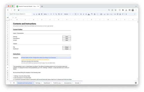
Get Started With the User Engagement Dashboard Template for SaaS!
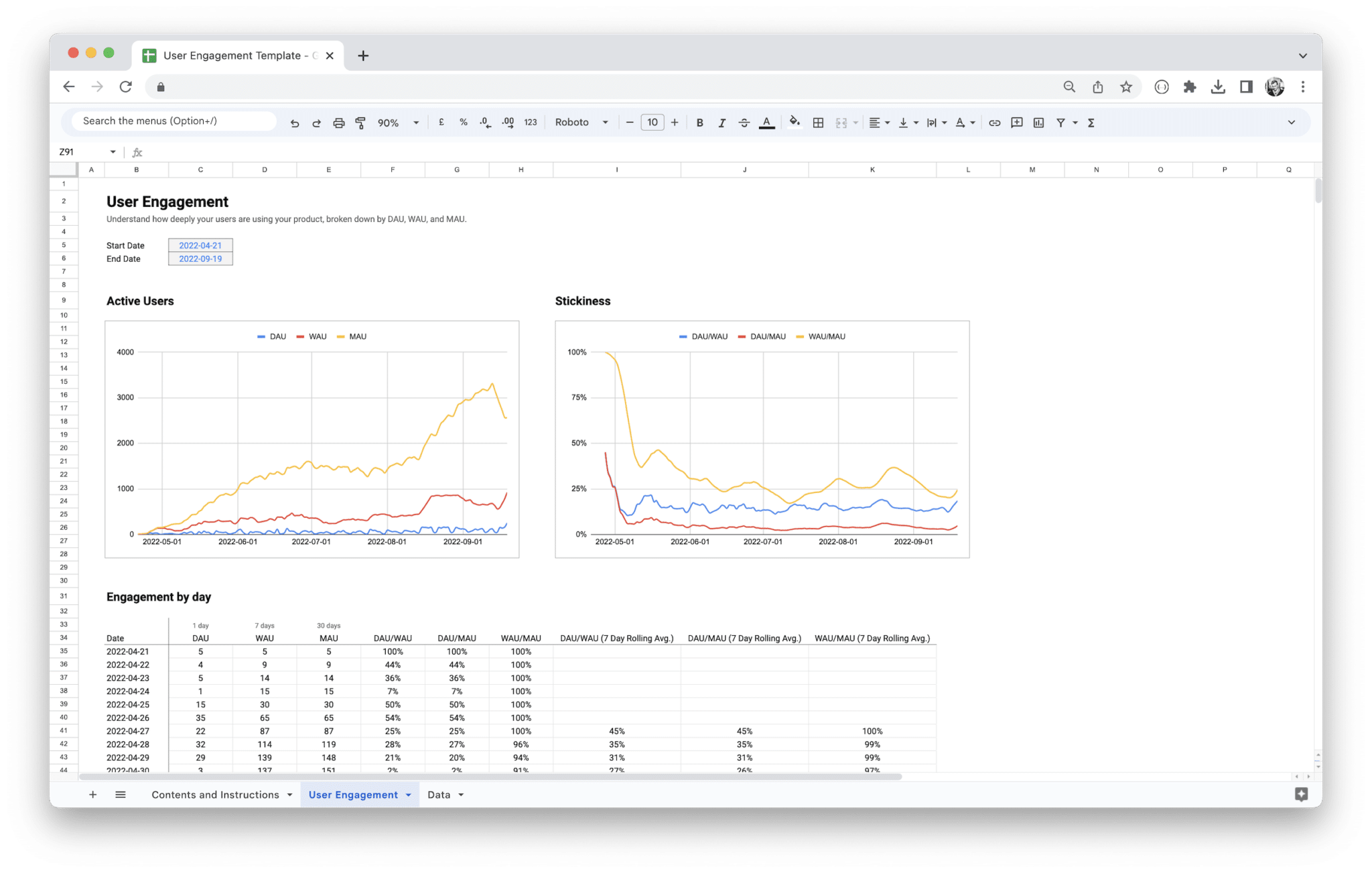
This User Engagement Template for SaaS and subscription-based businesses helps businesses to keep track of how regular users engage with their service.
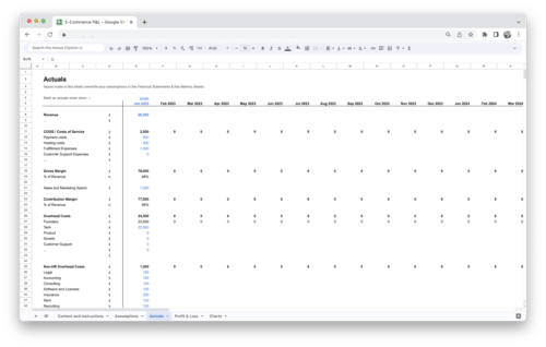
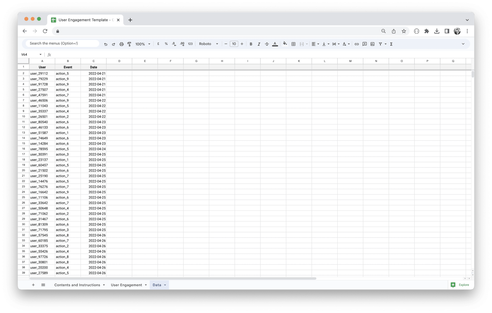
The template uses event data for certain actions a user might take in your product (for example, a signup or another performed action) to calculate daily (DAU), weekly (WAU), and monthly active users (MAU).
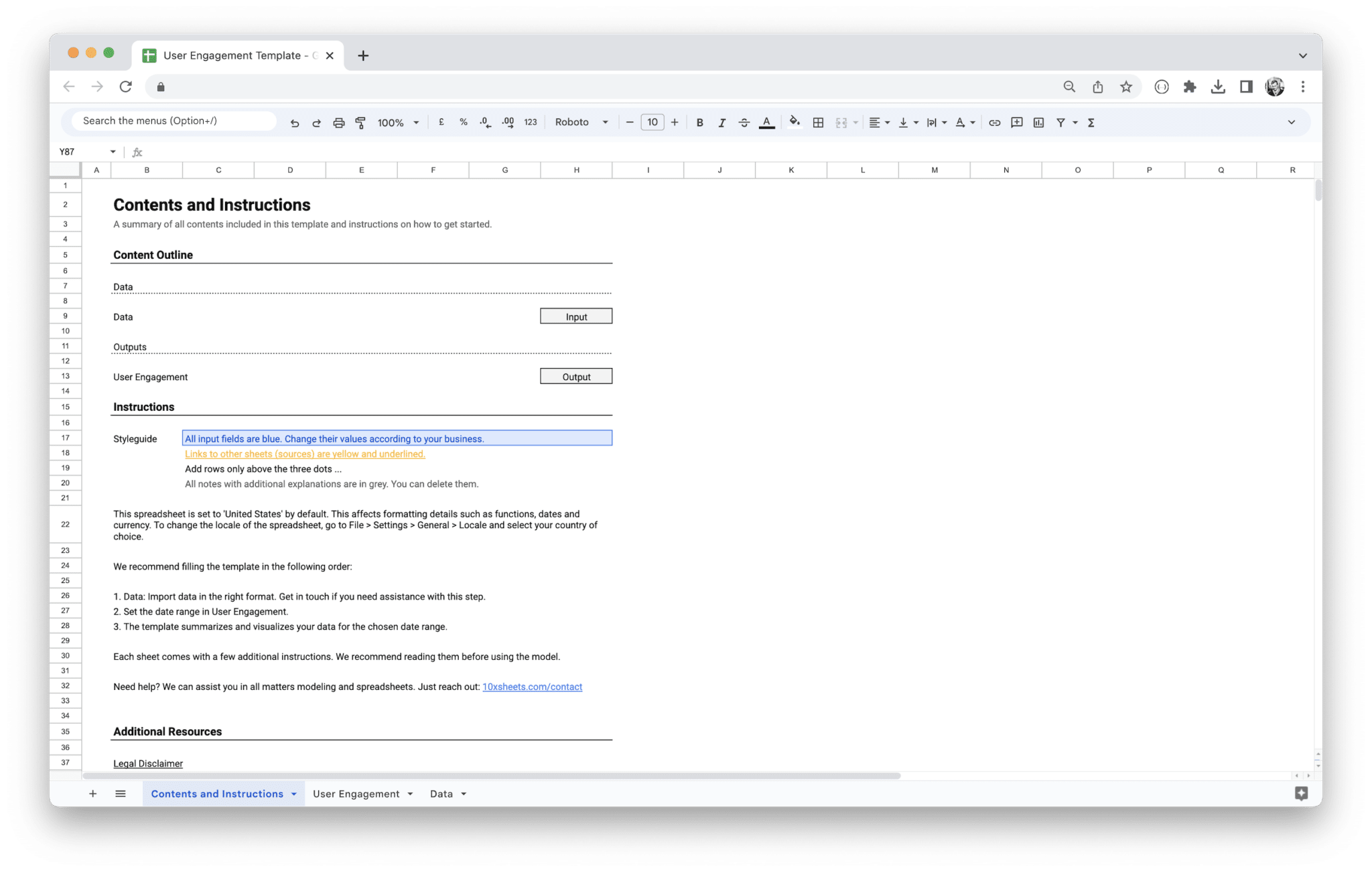
Follow the guide in the template that takes you step-by-step through each sheet and line of this template.
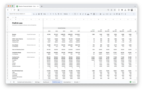
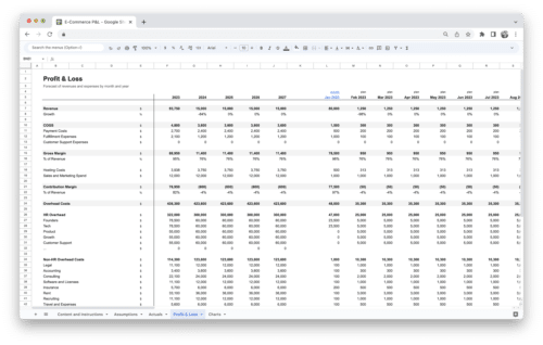
This template is part of our comprehensive SaaS Financial Model. The Financial Model for SaaS contains revenue and expense tracking and forecasting as well as financial statements, including a P&L, an optional balance sheet, and an optional cash flow statement. It also includes a dashboard to visualize all key financial metrics in one single view. We recommend it to all SaaS and subscription-based companies.
10XSheets offers Financial Modeling-as-a-service. Book a call if you need a consultation with any matter of financial modeling. We also create custom models specifically tailored to your business needs.
Make a one-time payment and
enjoy your template forever.
No extra costs, no strings attached,
more savings for you.
Keep your templates up-to-date
with free access to regular updates.
Related products
-
Sale!

Startup Financial Model Template
$119.00Original price was: $119.00.$79.00Current price is: $79.00. -
Sale!

E-Commerce Profit and Loss Statement
$119.00Original price was: $119.00.$79.00Current price is: $79.00. -
Sale!
Marketplace Profit and Loss Statement
$119.00Original price was: $119.00.$79.00Current price is: $79.00. -
Sale!
Standard Financial Model Template
$219.00Original price was: $219.00.$149.00Current price is: $149.00.